This is a sample module published to the sidebar_top position, using the -sidebar module class suffix. There is also a sidebar_bottom position below the menu.
This is a sample module published to the sidebar_bottom position, using the -sidebar module class suffix. There is also a sidebar_top position below the search.
100 Module Positions
Sample Drop Down Module
This is an example of a module published to the drop_down row. This row contains 6 modules. To enable the drop down simple publish any module to any of the drop_down_x positions.
This is a sample module to showcase the functionality of the S5 Flex Menu system. This menu system contains up to 40 module positions and you can publish any module to any of these positions under any menu item.
The S5 Vertical Accordion module is demonstrated on the left side of this page.
This module contains up to 10 module positions that appear in an accordion function so you can publish any of your favorite modules or custom html modules to one of the accordion slides and keep your site clean and consolidated while giving it a nice effect. This version of the module is customized specifically for this template and cannot be used with any other templates. We do have another version that can be used on any Joomla template.
The following is a quick list of features that are included with the module:
Responsive/Fluid layout
Set the width of the module
Onclick or Onmouseover trigger methods
Auto cycle or manual for transition
Set slide transition speed
Compatible with IE7+, Firefox, Opera 10.5+, Safari, Chrome
The Map it with Google module is displayed at the bottom of this page in the custom_5 position. Simply enter your address and the module uses the Google API to display a map with a marker to the address. A user simply clicks the marker and they are prompted with a popup box to get directions. Clicking "Get Directions" will take you to google maps with your business address already entered so all they have to do is enter their address to get directions. You can also specify the size of the map and whether or not to enable or disable certain controls.
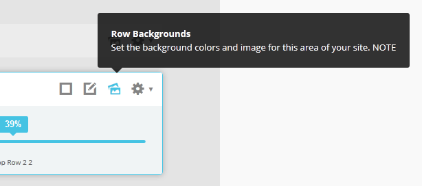
Parallax backgrounds as well as other background options are built directly into the Vertex Framework. Parallax causes the background image of an element to scroll at a different speed than your browser. For an example of this view the homepage of the Velocity template here and watch the background of the top_row1 area as you scroll down the page. This feature is found under "Backgrounds" tab in Vetex, where you can control the background for many areas of your website.
Features:
Set the scroll speed of the images
Set background repeat style
Set background image size, 100%, cover, contain, etc
Set custom backgrounds for all s5 rows in the framework.
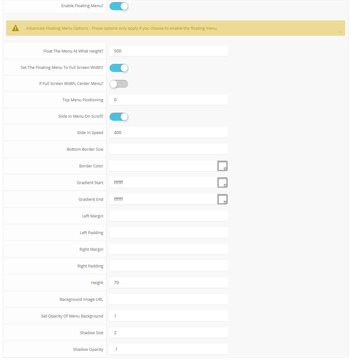
The floating menu feature is a great way for your users to easily navigate your website! The floating menu will show at the top of your browser once the screen reaches a certain point. You can determine the exact point at which this occurs via the template specific area of Vertex. NOTE: This is a Vertex addition and is not guaranteed to work with all Vertex Templates. Some custom CSS may need to be adjusted per template. This feature is not supported by IE7/8.
Features at a glance:
Set a background image to the menu, gradient or solid color
Set to snap or smooth scroll in
Determine at which point as you scroll down your page that the menu drops in
and many more features, just check out the screenshot below
Note - The tool tips script is by default disabled. If you wish to use it you must enable this script in the template's configuration area. This also includes site shaper installations.
This is an example of a module published to the right_inset position. There is also a left_inset position and many others, be sure to read the full description.
-no_border
This is the -no_border module style and can be applied to most module positions.
-none
This is the -none module style and can be applied to most module positions.
-black_no_border
This is the -black_no_border module style and can be applied to most module positions.
-highlight1
This is the -highlight1 module style and can be applied to most module positions.
-dark1
This is the -dark1 module style and can be applied to most module positions.
-highlight2
This is the -highlight2 module style and can be applied to most module positions.
-dark2
This is the -dark2 module style and can be applied to most module positions.
-grey
This is the -grey module style and can be applied to most module positions.
Right
This is an example of a module published to the right position. There are also left, insets, rows, etc. positions and many others, be sure to read the full description. This is the default style that will appear for most module positions in the white body area.
Bottom Row1 Modules
This is an example of a module published to the bottom_row_1 row. This row contains 6 modules, read above for a full description.
Bottom Row2 Modules
This is an example of a module published to the bottom_row_2 row and the module class suffix -plain. This row contains 6 modules, read above for a full description.
 Menu Module Example


")