This is a sample module published to the sidebar_top position, using the -sidebar module class suffix. There is also a sidebar_bottom position below the menu.
This is a sample module published to the sidebar_bottom position, using the -sidebar module class suffix. There is also a sidebar_top position below the search.
This plugin adds Disqus comments and links to any Joomla article or blog view, it can be demo'd at the bottom of this page. Disqus is a powerful and free comment system that will integrate into any website.
Features at a glance
Specify your Disqus shortname
Select a language
Specify which categories will use the plugin
Specify individual pages to use the plugin
Enable or disable the comments link on the category listing
Enable or disable the comments link on the full article
Enable or disable the comments link on the featured articles
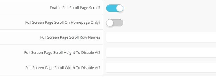
The full page scroll option takes each row of Vertex and sets it to the height of your screen. With the arrow buttons of your keyboard or the vertical scrolling of your mouse the screen will jump to the next section. Each row that has modules published to it will show as the full height of your screen. To demo this check out the homepage of this demo. You can enable on the homepage only or have it show on all pages. We recommend that it shows only on the homepage.
You can place the below code on any DIV directly as a child to <div id="s5_body_padding"> and it will make it show up full screen.
class="s5_slidesection"
The below screenshot shows the admin area under the "layout" area of Vertex. You simply start adding names for the row names and then it will be enabled. Be sure to separate them by commas. You can enable the full page scroll to just show on the homepage only.
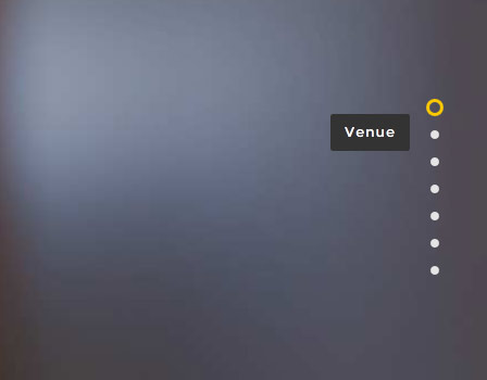
Fullscreen scroll navigation that shows on the right hand side of yoursite:
Occasionally we need to use custom HTML to obtain the layouts shown on our demos in specific modules. The code below is what was used on this template. It is best to enter this code directly into the HTML editor function of your editor. Some area may require that you enable the Ion Icons (Under General) and Scroll Reveal (Under JavaScripts) features in the template configuration.
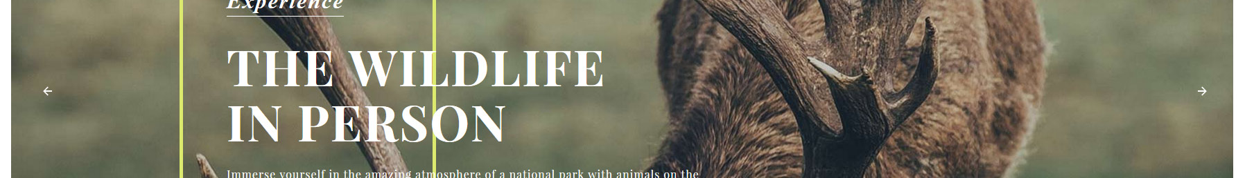
Image and Content Fader:
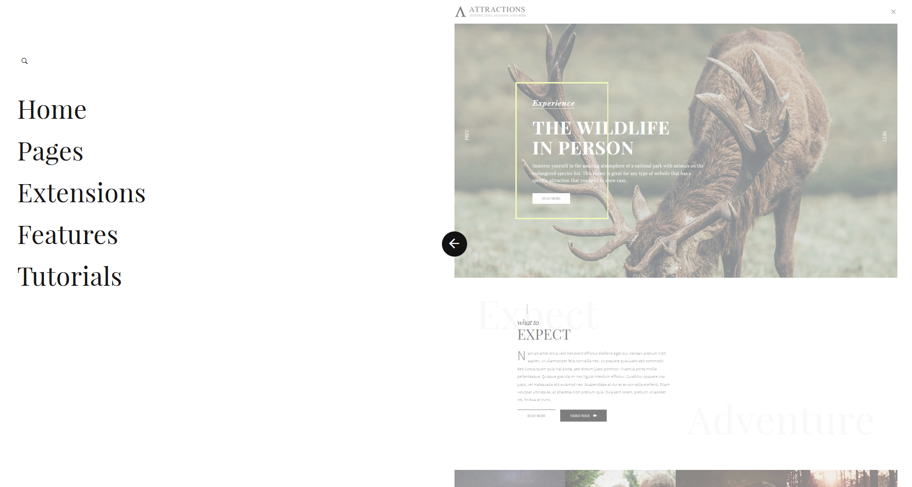
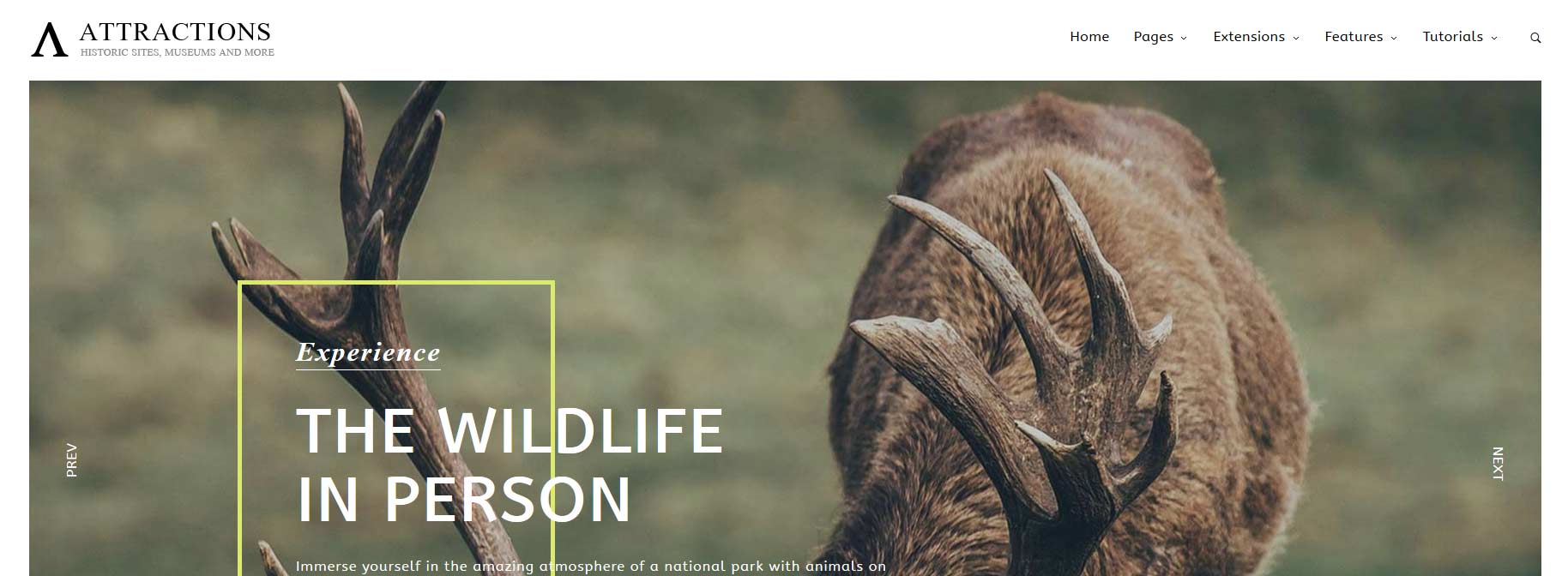
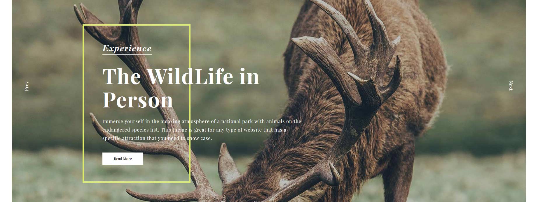
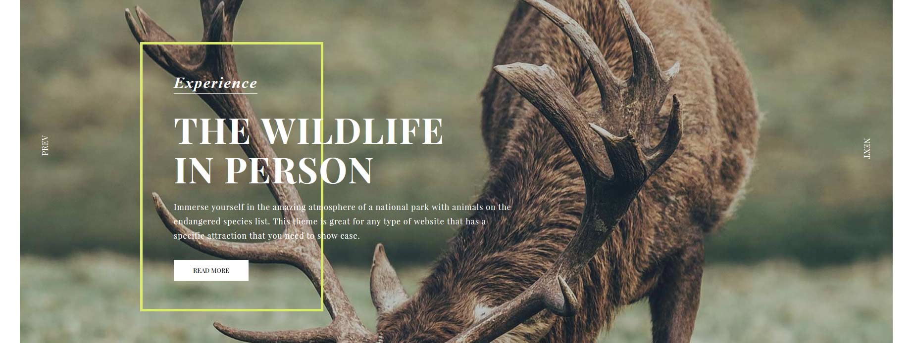
The S5 Image and Content Fader is shown on the homepage in the custom_1 position. You can enter any custom HTML into each slide. Simply enter the images and into the default fields in the back end of the module. This demo uses 1775x1016 images, but you can use any image size; just make sure they are all the same size. Features like size, zoom, slide effects, and others are controlled in the module's back end. For setup instructions for please visit: http://www.shape5.com/documentation/Joomla/Extensions/S5-Image-and-Content-Fader
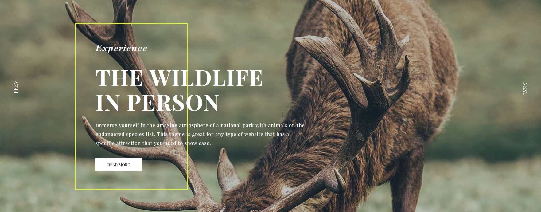
Image Slide 1 Text:
<span class="s5_iacf_line">
<span class="s5_iacf_smalltitle">Experience</span>
<span class="s5_iacf_bigtext">The WildLife in Person </span>
<span class="s5_iacf_smalltext">
Immerse yourself in the amazing atmosphere of a national park with animals on the endangered species list. This theme is great for any type of website that has a specific attraction that you need to show case.</span>
<br />
<a style="float:none" class="readon" href="index.php/extensions/s5-image-and-content-fader">Read More</a>
</span>
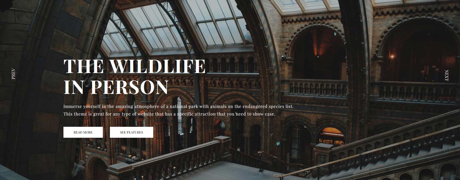
Image Slide 2 Text:
<span class="s5_iacf_bigtext">The WildLife in Person </span>
Immerse yourself in the amazing atmosphere of a national park with animals on the endangered species list. This theme is great for any type of website that has a specific attraction that you need to show case.
<br />
<a style="float:none" class="readon" href="index.php/extensions/s5-image-and-content-fader">Read More</a>
<a style="float:none" class="readon readon_white" href="index.php/extensions/s5-image-and-content-fader">See Features</a>
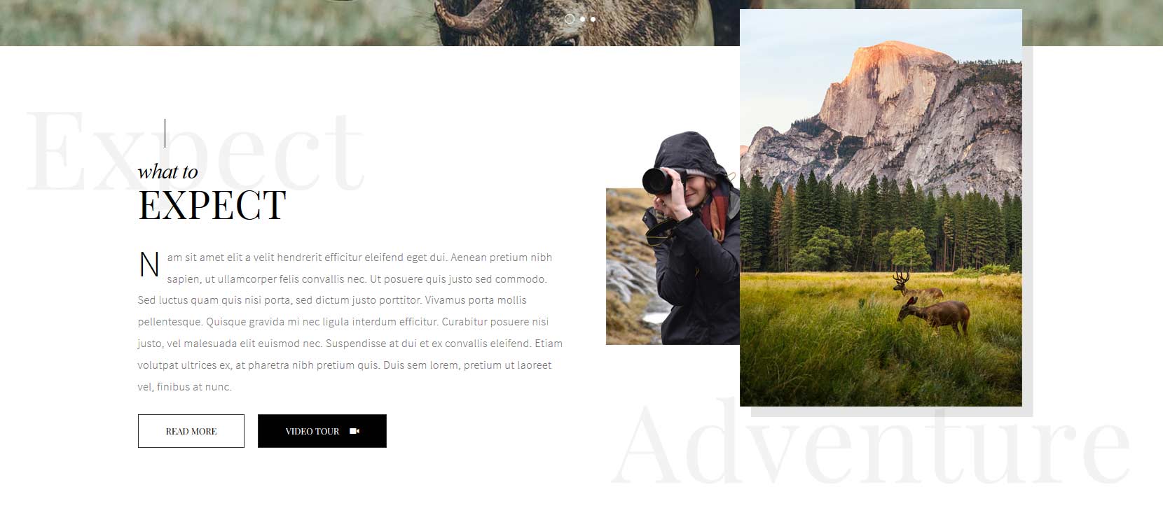
What to Expect
There is a custom HTML module that is published to the top_row1_1 position with a module title of "-titleleft". The background image is controlled under the Main/Layout tab in the template configuration. There is a second custom HTML published to the top_row1_2 position. Scroll reveal must be enabled for the transition effect in the top_row1_2 position.
What to expect text:
<span class="firstcharacter2">N</span>am sit amet elit a velit hendrerit efficitur eleifend eget dui. Aenean pretium nibh sapien, ut ullamcorper felis convallis nec. Ut posuere quis justo sed commodo. Sed luctus quam quis nisi porta, sed dictum justo porttitor. Vivamus porta mollis pellentesque. Quisque gravida mi nec ligula interdum efficitur. Curabitur posuere nisi justo, vel malesuada elit euismod nec. Suspendisse at dui et ex convallis eleifend. Etiam volutpat ultrices ex, at pharetra nibh pretium quis. Duis sem lorem, pretium ut laoreet vel, finibus at nunc. <br /><br /> <a class="readon">Read more</a> <a class="s5mb readon darkbutton" href="http://www.youtube.com/embed/VGiGHQeOqII" id="youtube" rel="width:800,height:447" title="Youtube.com Video">Video Tour <span class="ion-ios-videocam buttonicon"></span></a>
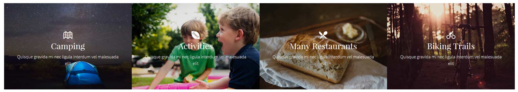
This area consists of the S5 Horizontal Accordion menu published to custom_2 position. Modules must be published to the following positions, s5_ha_1, s5_ha_2, s5_ha_3, s5_ha_4. Ion Icons must be enabled for the icons to appear. The available Ion Icons can be found: http://ionicons.com/
Example code for one of the slides:
<span class="s5accordionicson ion-map"></span>
<h3>Camping</h3>
Quisque gravida mi nec ligula interdum vel malesuada elit
<div style="clear:both;"></div>
<a style="float:none" class="readon" href="">Read More</a>
Get Your Tour Tickets:
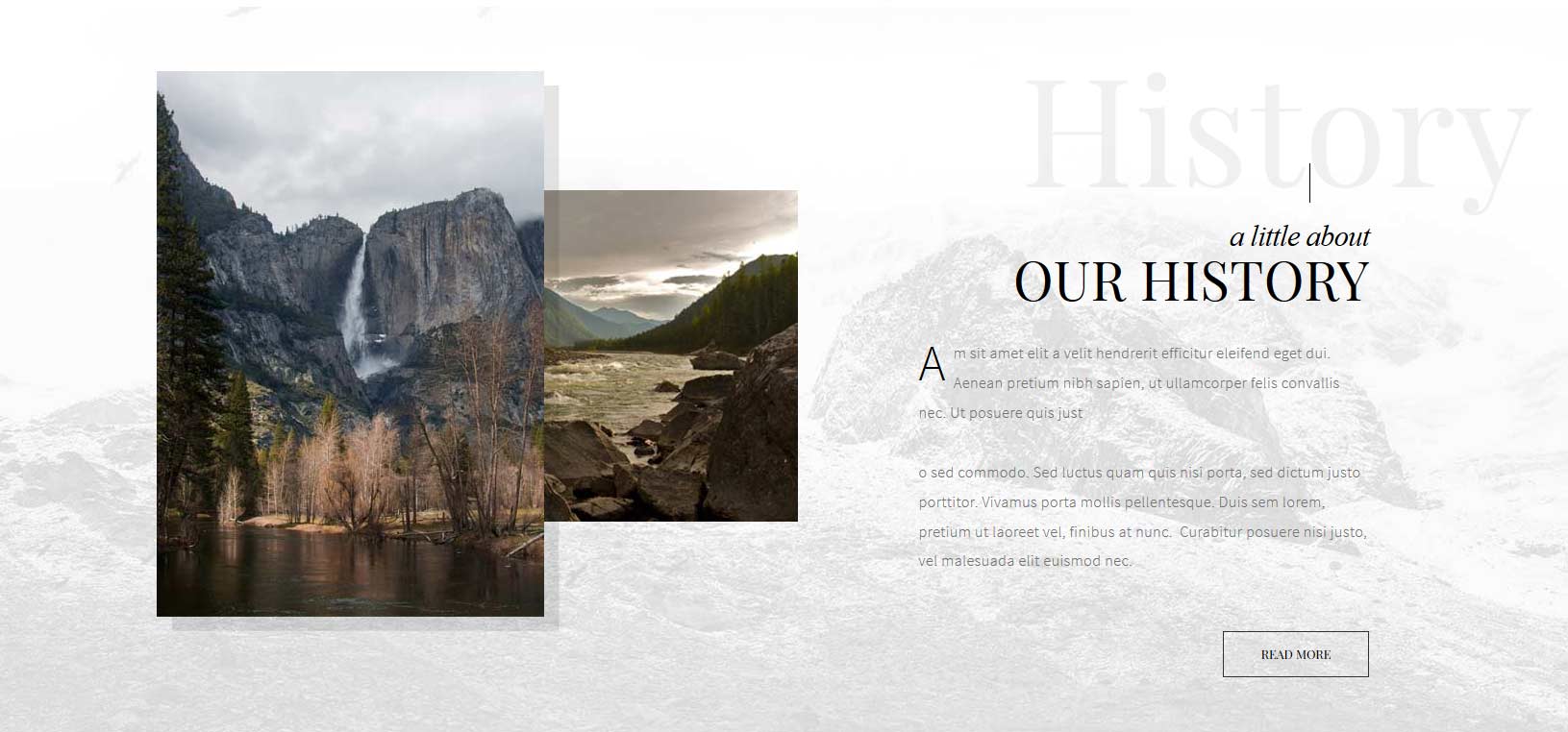
There is a custom HTML module that is published to the top_row2_1 position. The background image is controlled under the Main/Layout tab in the template configuration. There is a second custom HTML published to the top_row2_2 position. Scroll reveal must be enabled for the transition effect in the top_row1_2 position.
There is a custom HTML module that is published to the top_row3_1 position. Scroll reveal must be enabled for the transition effect in the top_row3_1 position. There is a second custom HTML published to the top_row3_2 position. The background image is controlled under the Main/Layout tab in the template configuration.
<span class="firstcharacter2">A</span>m sit amet elit a velit hendrerit efficitur eleifend eget dui. Aenean pretium nibh sapien, ut ullamcorper felis convallis nec. Ut posuere quis just<br /><br />o sed commodo. Sed luctus quam quis nisi porta, sed dictum justo porttitor. Vivamus porta mollis pellentesque. Duis sem lorem, pretium ut laoreet vel, finibus at nunc. Curabitur posuere nisi justo, vel malesuada elit euismod nec.<br /><br />
<div class="rtlbutton"><a class="readon">Read more</a></div>
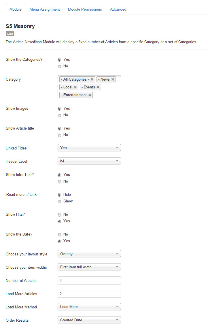
Masonry Module:
This module is published to the above_columns_1 position, and does not use any custom HTML. The images are defined as the article's intro image in the settings of the article. The background image is controlled under the Main/Layout tab in the template configuration. For setup instructions for S5 Masonry please visit:
https://www.shape5.com/documentation/Joomla/Extensions/S5-Masonry
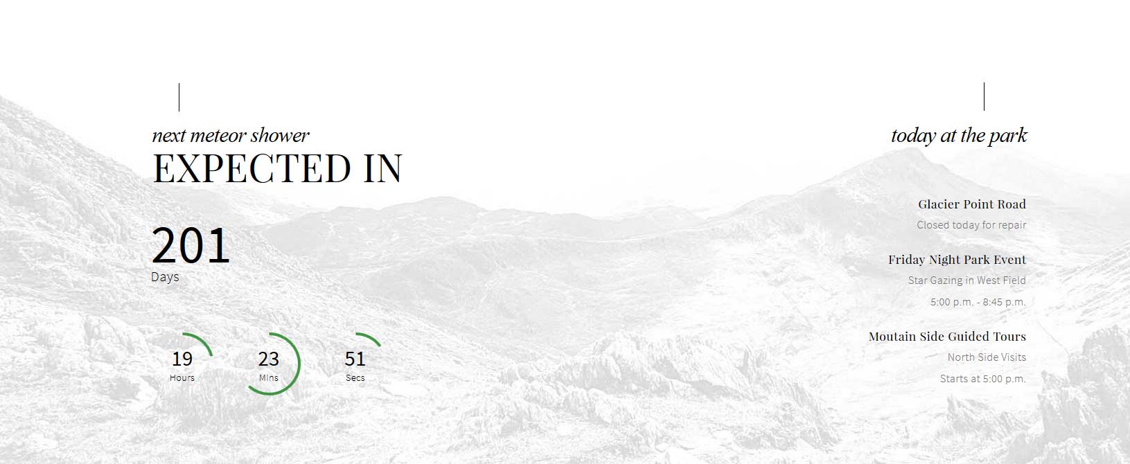
Countdown and today at the park:
The countdown timer will show up in the bottom_row1_1 position. You can change all the settings for it in the Theme Specific area of Vertex. There is a custom HTML module published to the bottom_row1_1 position with a module class suffix of "titleleft". The title (next meteor shower expected in class=hide_580) of it includes a responsive hide class so that this module is hidden at 580 screen width when the countdown timer is also hidden. The module on the right is a standard Joomla newsflash module published to the bottom_row1_2 position with a class suffix of "titleright".
Countdown and today at the park:
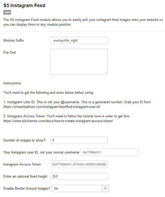
The S5 Instagram Feed module is published to the custom_5 module position with a module suffix of "overlaytitle_right". Its set to show 6 images at once with a fixed height of 250.
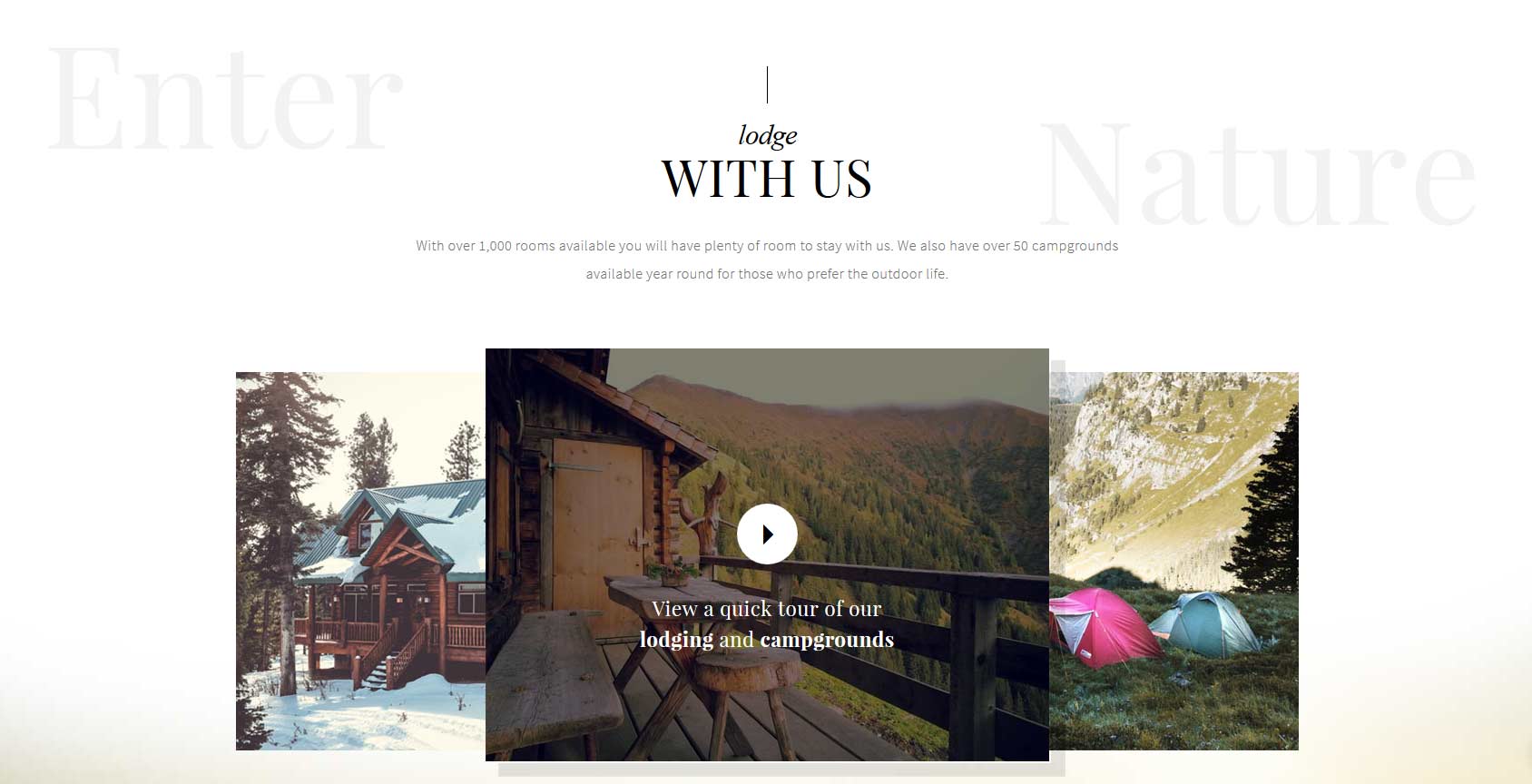
Lodge with Us:
There is a custom HTML module that is published to the bottom_row2_1 position with a module suffix of " titlecenter". Scroll reveal must be enabled for the transition effects in this position. The background image is controlled under the Main/Layout tab in the template configuration.
Code:
<div class="s5_lodgecenter">
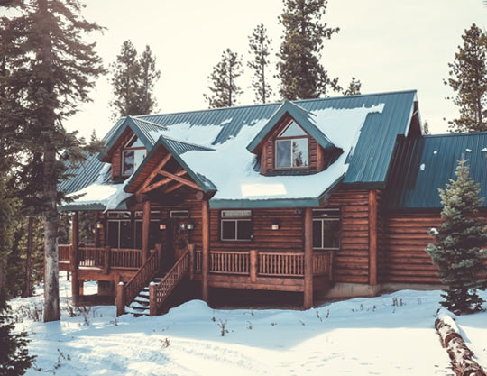
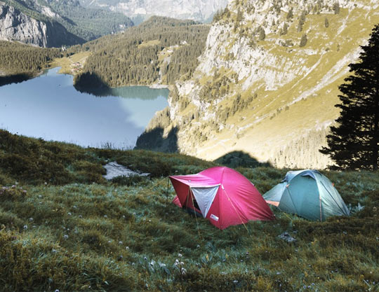
With over 1,000 rooms available you will have plenty of room to stay with us. We also have over 50 campgrounds available year round for those who prefer the outdoor life.
</div>
<br /><br /><br />
<div class="s5_lodgeimagewrap">
<div class="s5_lodgeleft">
<img src="images/lodging.jpg" class="" style="position: relative;" alt="lodging" data-sr="enter left, over 1s, move 300px" /></div>
<div class="s5_lodgeright">
<img src="images/camping.jpg" class="" style="position: relative;" alt="camping" data-sr="enter right, over 1s, move 300px"/></div>
<div class="overlay_outer two s5_lodgevideo bottomright_shadow" style="position:absolute;margin:-28px auto 0;">
<div class="overlay_inner">
<div class="overlay_hover_outer">
<div class="overlay_hover_inner2">
<div class="overlay_centered">
<a href="http://www.youtube.com/embed/VGiGHQeOqII" id="youtube" rel="width:800,height:447" title="Youtube.com Video" class="s5mb s5_videoicon ion-android-arrow-dropright"></a>
<span class="s5_highlightfont fontsized">
View a quick tour of our<br>
<strong>lodging</strong> and <strong>campgrounds</strong>
</span>
</div>
</div>
<div class="overlay_hover_inner">
</div>
<img src="/attractions/images/lodgingvideo.jpg" alt="lodging video" >
</div>
</div>
</div>
<div style="clear:both;"></div>
</div>
S5 Quick Contact Popup and Controller:
The S5 Quick Contact is heavily customized to work with this template for reservations. Along with the module there is a controller area, which allows the user to first select a few inputs and then those inputs are passed into the S5 Quick Contact module to complete the form and submit it. That controller is shown below: .
When the button in the controller area is clicked the S5 Quick Contact opens in an overlay screen that covers the site.
You can also open the S5 Quick Contact by adding onclick="s5_custom_7_open()" to any element. Click on the Reserve Now button below for an example.
1. Publish the S5 Quick Contact module to the custom_7 position to all pages. This will not actually show on the page, this position is only contained in the overlay area that covers the site when triggered. Configure the module as desired.
2. Publish the controller code to any module position in a custom html module, on the demo it is published to custom_3 position.
3. In the template configuration you need to define which fields from the S5 Quick Contact module that you would like to show in the controller area. Enter the number of the fields you would like to show separated by commas. For example if I want to show the second, fifth and seventh fields, I would enter 2,5,7 in this field.
4. If you would like to add a button that opens the overlay area you can simply add onclick="s5_custom_7_open()" to any element. The Reserve Now button shown above uses the following code:
This is a custom HTML module published to the custom_6 module position.
Code:
<div style="margin: 0 auto; text-align: center; color: #fff; width: 52%;" class="s5_highlightfont">
<h2 style="font-weight: normal;">“Look deep into nature and then you will understand everything better”</h2>
- Albert Einstein<br /><br /><br /></div>
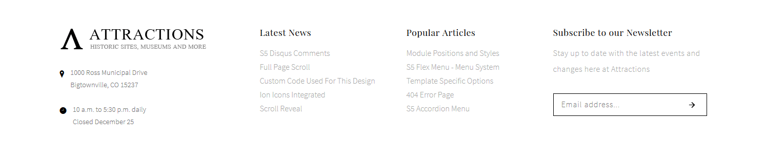
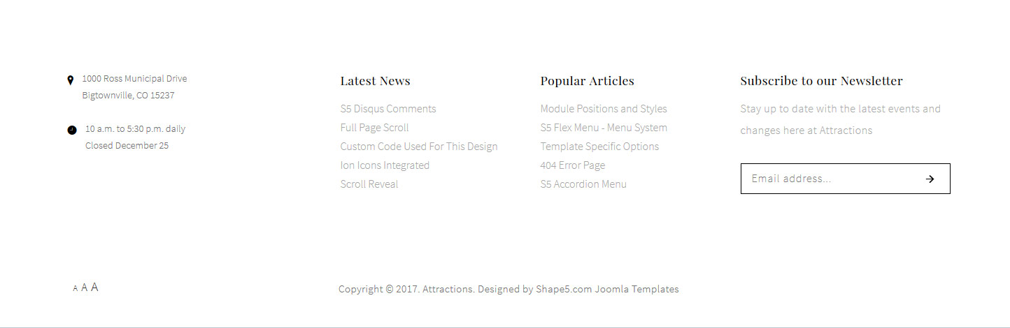
Footer Area:
The logo pulls from your main site logo. This can be disabled from the Vertex theme specific area. The address and time info is a custom HTML module published to the bottom_row3_1 position, the code is below. The 2 menus are standard Joomla menus published to the bottom_row3_2 and bottom_row3_3 positions. In the bottom_row3_4 position is published the S5 MailChimp module.
Code:
<div class="s5_address_wrap">
<div class="s5_address_left"><span class="addressicon ion-ios-location"></span></div>
<div class="s5_address_right"><span class="address_wrap"> 1000 Ross Municipal Drive <br>Bigtownville, CO 15237 <br><br> </span></div>
<div style="clear: both;"></div>
<div class="s5_address_left"><span class="addressicon ion-ios-clock"></span></div>
<div class="s5_address_right">10 a.m. to 5:30 p.m. daily<br/>
Closed December 25</div>
<div style="clear: both;"></div>
</div>
Social Icons:
The social icons are not shown on this demo but they are stylized for position custom_8 and they do come with the site shaper. They are a custom html module. Ion Icons must be enabled for the icons to appear.
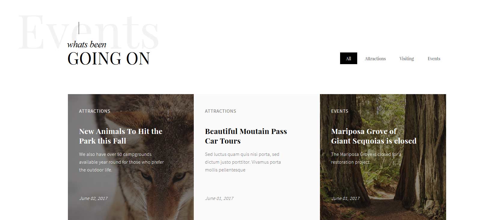
The Masonry module is demo'd on this page, and is a powerful module that pulls your article from a category or categories and can display them in masonry style format. The module automatically changes on screen resize to fit the screen a user is viewing them on. You can choose to output a "load more" button that will load a set number of articles you define via AJAX. The second method to load articles is "scroll to load" which will load articles once you scroll to the bottom of your screen. You simply assign an intro image under your "Image and Links" parameters area of your article and then if you choose to show it in the module it will show up. The intro text will show up if you've added text to your article before your read more button.
Features:
Choose to enable scroll to load or load more or neither
Show or hide category elector
Show or hide read more
Set how many articles are to be shown
Set how many articles are to load via AJAX button or scroll methods
Order articles by publish date, created date, random or ordering
Show or hide hits
Standard layout or hover layout
Responsive ready and more, view the below admin screenshot to see all the features
Ion Icons is an iconic font that gives you scalable vector icons that can be customized by any font css command, such as size, color, backgrounds, hover effects and more. Below you will see several examples of this feature in action, but please visit http://ionicons.com/ for a full list of all icons available.
Our Scroll Reveal feature is powered by the script found here: https://github.com/julianlloyd/scrollReveal.js. The script allows you to add "data-sr" to HTML elements for on page scroll animations. We recommend adding to DIVs over SPAN etc as DIVs can move vs SPAN tags just fading in. Once you add the code to a DIV refresh a page or scroll down and it will animate in. It will only do this once until you refresh the page again. The great feature about the script is you can use plain English to describe how you'd like to animate your HTML element.
Example of this in action (refresh this page if you didn't see it already):
enter left, over 1.33s, move 100px
enter bottom, wait 1s, move 100px
enter left move 500px, over 1.33s, wait 2.5s
Code used for the above:
<div data-sr="enter left, over 1.33s, move 100px">enter left, over 1.33s,
move 100px</div>
<div data-sr="enter bottom, wait 1s, move 100px">enter bottom, wait 1s, move
100px</div>
<div data-sr="enter left move 500px, over 1.33s, wait 2.5s">enter left move
500px, over 1.33s, wait 2.5s</div>
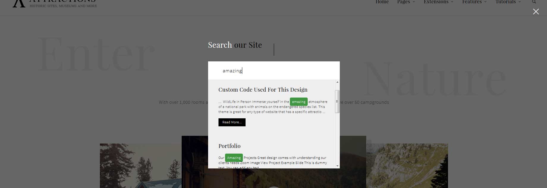
The S5 Live Search module is demo'd on this page and can be used on any Joomla template. The styling of the module shown here is customized specifically for this template with css overrides, and cannot be used with any other template. The same module can be used on any template, but with default or other styling in its place.
Allow your users to search quickly and without loading or refreshing pages with our amazing ajax search module! Simply publish the module to the 'search' position.
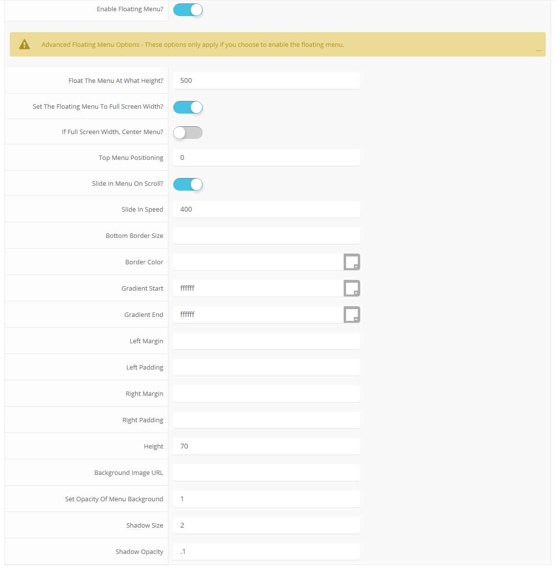
The floating menu feature is a great way for your users to easily navigate your website! The floating menu will show at the top of your browser once the screen reaches a certain point. You can determine the exact point at which this occurs via the template specific area of Vertex. NOTE: This is a Vertex addition and is not guaranteed to work with all Vertex Templates. Some custom CSS may need to be adjusted per template. This feature is not supported by IE7/8.
Features at a glance:
Set a background image to the menu, gradient or solid color
Set to snap or smooth scroll in
Determine at which point as you scroll down your page that the menu drops in
and many more features, just check out the screenshot below
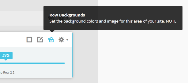
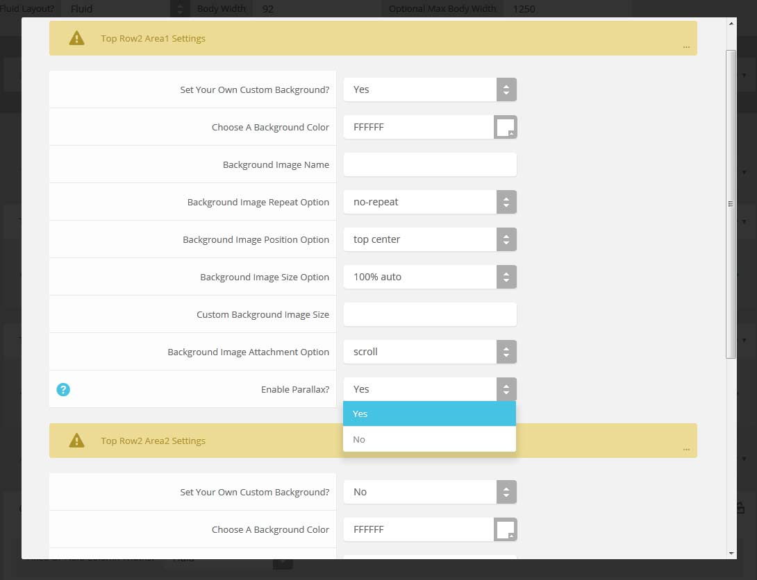
Parallax backgrounds as well as other background options are built directly into the Vertex Framework. Parallax causes the background image of an element to scroll at a different speed than your browser. For an example of this view the homepage of the Velocity template here and watch the background of the top_row1 area as you scroll down the page. This feature is found under "Backgrounds" tab in Vetex, where you can control the background for many areas of your website.
Features:
Set the scroll speed of the images
Set background repeat style
Set background image size, 100%, cover, contain, etc
Set custom backgrounds for all s5 rows in the framework.
L orem ipsum dolor sit amet, consectetur adipiscing elit. Mauris tristique lobortis orci ac lacinia. Fusce eu purus eget diam vehicula auctor nec eu elit. Morbi consequat facilisis orci vel malesuada. Donec ultrices molestie sollicitudin. Morbi consequat facilisis orci vel malesuada. Donec ultrices molestie sollicitudin. Mauris tristique lobortis orci ac lacinia. Mauris tristique lobortis orci ac lacinia.
Apply a drop cap with a wrapping span class as follows: <span class="firstcharacter">L</span>orem ipsum
L orem ipsum dolor sit amet, consectetur adipiscing elit. Mauris tristique lobortis orci ac lacinia. Fusce eu purus eget diam vehicula auctor nec eu elit. Morbi consequat facilisis orci vel malesuada. Donec ultrices molestie sollicitudin. Morbi consequat facilisis orci vel malesuada. Donec ultrices molestie sollicitudin. Mauris tristique lobortis orci ac lacinia. Mauris tristique lobortis orci ac lacinia.
Apply a drop cap with a wrapping span class as follows: <span class="firstcharacter2">L</span>orem ipsum
Porem ipsum dolor sit amet, consectetur adipiscing elit. Mauris tristique lobortis orci ac lacinia. Fusce eu purus eget diam vehicula auctor nec eu elit. Morbi consequat facilisis orci vel malesuada. Donec ultrices molestie sollicitudin. Morbi consequat facilisis orci vel malesuada. Donec ultrices molestie sollicitudin. Mauris tristique lobortis orci ac lacinia. Mauris tristique lobortis orci ac lacinia.
Apply a drop cap with a class on a wrapping paragraph tag as follows: <p class="drop_class">Porem ipsum</a>
Porem ipsum dolor sit amet, consectetur adipiscing elit. Mauris tristique lobortis orci ac lacinia. Fusce eu purus eget diam vehicula auctor nec eu elit. Morbi consequat facilisis orci vel malesuada. Donec ultrices molestie sollicitudin. Morbi consequat facilisis orci vel malesuada. Donec ultrices molestie sollicitudin. Mauris tristique lobortis orci ac lacinia. Mauris tristique lobortis orci ac lacinia.
Apply a drop cap with a class on a wrapping paragraph tag as follows: <p class="drop_class2">Porem ipsum</a>
Video Overlay
Lorem ipsum dolor sit amet, consectetur adipiscing elit. Morbi efficitur scelerisque ligula, sit amet fermentum metus.
1. Enter the url of your video in the video src area.
2. Enter your background image under the video_overlay_wrap style area. This is the background image that appears before the video loads and at 1024px. Please note that all videos disable at 1024px due to restrictions on tablets and phones.
3. Enter an optional max-height under the video_overlay_wrap style area. This will prevent the video from becoming larger than the height specified.
4. Enter an optional min-height under the video_overlay_wrap style area. This will prevent the video from becoming smaller than the height specified. This is very useful for when the video is disabled at 750px, and the background image shows in its place.
4. Enter an optional width under the video_overlay_wrap style area. This will stretch the video to a specified length, but will be cropped off by the surrounding parent div.
4. Enter your desired text in the video_overlay_text_wrap_inner area. Text should be minimal to avoid any space issues on smaller screens; videos maintain ratio and decrease on smaller devices.
<div class="video_overlay_wrap"
style="max-height:700px;min-height:300px;width:1500px;background: url(/demo/attractions/images/video_preload.jpg);">
<video muted autoplay="autoplay" loop="loop" src="/demo/attractions/images/video.mp4"></video>
<div class="video_overlay_text_wrap">
<div class="video_overlay_text_wrap_inner">
Lorem ipsum dolor sit amet, consectetur adipiscing elit. Morbi efficitur
scelerisque ligula, sit amet fermentum metus.
<div style="clear:both;height:0px;"></div>
</div>
</div>
</div>
This is a styled box. Use <div class="black_box">Your content goes here!</div>
This is a styled box. Use <div class="gray_box">Your content goes here!</div>
This is a styled box. Use <div class="red_box">Your content goes here!</div>
This is a styled box. Use <div class="blue_box">Your content goes here!</div>
This is a styled box. Use <div class="green_box">Your content goes here!</div>
This is a styled box. Use <div class="yellow_box">Your content goes here!</div>
This is a styled box. Use <div class="orange_box">Your content goes here!</div>
Images
This is an image with the "boxed" class applied:
This is an image with the "boxed_white" class applied:
This is an image with the "boxed_black" class applied:
This is an image with the "padded" class applied:
This is an image with the "full_width" class applied. This can also be done automatically in the template configuration. Be sure to review our Vertex Guide here for other full width image options.
Example of code used above. Notice on the first DIV there is a "four". You can enter one, two, three, four, five and six depending on how many team members you want on one row (Be sure to keep that space before the number too):
The following list will support plain text such as numbers of ion icons, class="ul_circle_content":
01Lorem ipsum dolor sit amet, consectetur adipiscing elit. Sed ut mattis quam. Suspendisse tempor mollis porta. Quisque consequat justo risus, et venenatis erat consectetur sit amet. Curabitur varius tortor metus, non convallis felis fermentum sed. Nam varius justo nulla, et ultricies augue venenatis ut. Proin tempor aliquam dapibus. Pellentesque euismod vehicula est, a euismod lacus feugiat sit amet.
02Lorem ipsum dolor sit amet, consectetur adipiscing elit. Sed ut mattis quam. Suspendisse tempor mollis porta. Quisque consequat justo risus, et venenatis erat consectetur sit amet. Curabitur varius tortor metus, non convallis felis fermentum sed. Nam varius justo nulla, et ultricies augue venenatis ut. Proin tempor aliquam dapibus. Pellentesque euismod vehicula est, a euismod lacus feugiat sit amet.
03Lorem ipsum dolor sit amet, consectetur adipiscing elit. Sed ut mattis quam. Suspendisse tempor mollis porta. Quisque consequat justo risus, et venenatis erat consectetur sit amet. Curabitur varius tortor metus, non convallis felis fermentum sed. Nam varius justo nulla, et ultricies augue venenatis ut. Proin tempor aliquam dapibus. Pellentesque euismod vehicula est, a euismod lacus feugiat sit amet.
Lorem ipsum dolor sit amet, consectetur adipiscing elit. Sed ut mattis quam. Suspendisse tempor mollis porta. Quisque consequat justo risus, et venenatis erat consectetur sit amet. Curabitur varius tortor metus, non convallis felis fermentum sed. Nam varius justo nulla, et ultricies augue venenatis ut. Proin tempor aliquam dapibus. Pellentesque euismod vehicula est, a euismod lacus feugiat sit amet.
<li><span class="circle_item">01</span>Lorem ipsum dolor sit amet,
consectetur adipiscing elit. Sed ut mattis quam. Suspendisse tempor mollis porta.
Quisque consequat justo risus, et venenatis erat consectetur sit amet. Curabitur
varius tortor metus, non convallis felis fermentum sed. Nam varius justo nulla,
et ultricies augue venenatis ut. Proin tempor aliquam dapibus. Pellentesque
euismod vehicula est, a euismod lacus feugiat sit amet.</li>
<li><span class="circle_item"><i class="ion-star"></i></span>Lorem
ipsum dolor sit amet, consectetur adipiscing elit. Sed ut mattis quam.
Suspendisse tempor mollis porta. Quisque consequat justo risus, et venenatis
erat consectetur sit amet. Curabitur varius tortor metus, non convallis felis
fermentum sed. Nam varius justo nulla, et ultricies augue venenatis ut. Proin
tempor aliquam dapibus. Pellentesque euismod vehicula est, a euismod lacus
feugiat sit amet.</li>
The following list will support lists up to number 9, add the following class to the UL wrapping the below LI elements, class="ul_numbers":
This is a sample styled number list <li class="li_number1">Your content goes here!</li>
This is a sample styled number list <li class="li_number2">Your content goes here!</li>
This is a sample styled number list <li class="li_number3">Your content goes here!</li>
This is a sample styled number list <li class="li_number4">Your content goes here!</li>
To use the price table on your site grab the following example code below and add to your site. The price table is fully responsive and can display up to 7 price columns. Once you have determined the number of columns you will be using set the wrapper div to the number of columns that you've added. You can use the wrapping classes of "s5_pricetable_1" to "s5_pricetable_7".
<div class="s5_pricetable_3">
<div class="s5_pricetable_column">
<div class="s5_pricetable_column_padding">
<div class="s5_title">Basic</div>
<div class="s5_price_wrap">
<span class="dollarsign">$</span><span class="price">49</span><span
class="month">/per month</span>
</div>
<div class="s5_options">
<div class="s5_option">
Unlimited Space & Traffic
</div>
<div class="s5_option">
99.9% Server Uptime
</div>
<div class="s5_option">
24/7 Customer Care
</div>
<div class="s5_option">
30 Days Money Back
</div>
</div>
Make any Youtube, Vimeo, etc video you embed to your site work with responsive by wrapping with a DIV with a class of "s5_video_container". The below Youtube Video will shrink when the area its contained in gets too small for it:
Note - The tool tips script is by default disabled. If you wish to use it you must enable this script in the template's configuration area. This also includes site shaper installations.
This template is built on the very powerful S5 Vertex Framework, which comes packed with amazing features! Learn More About Vertex...
Every template built on Vertex also comes with its own unique template specific options applicable to that particular template such as highlight colors, social icons, and much more. These features are in addition to the standard functions of Vertex, and are still controlled through the very user friendly interface of Vertex. This page will document the features specific to this template.
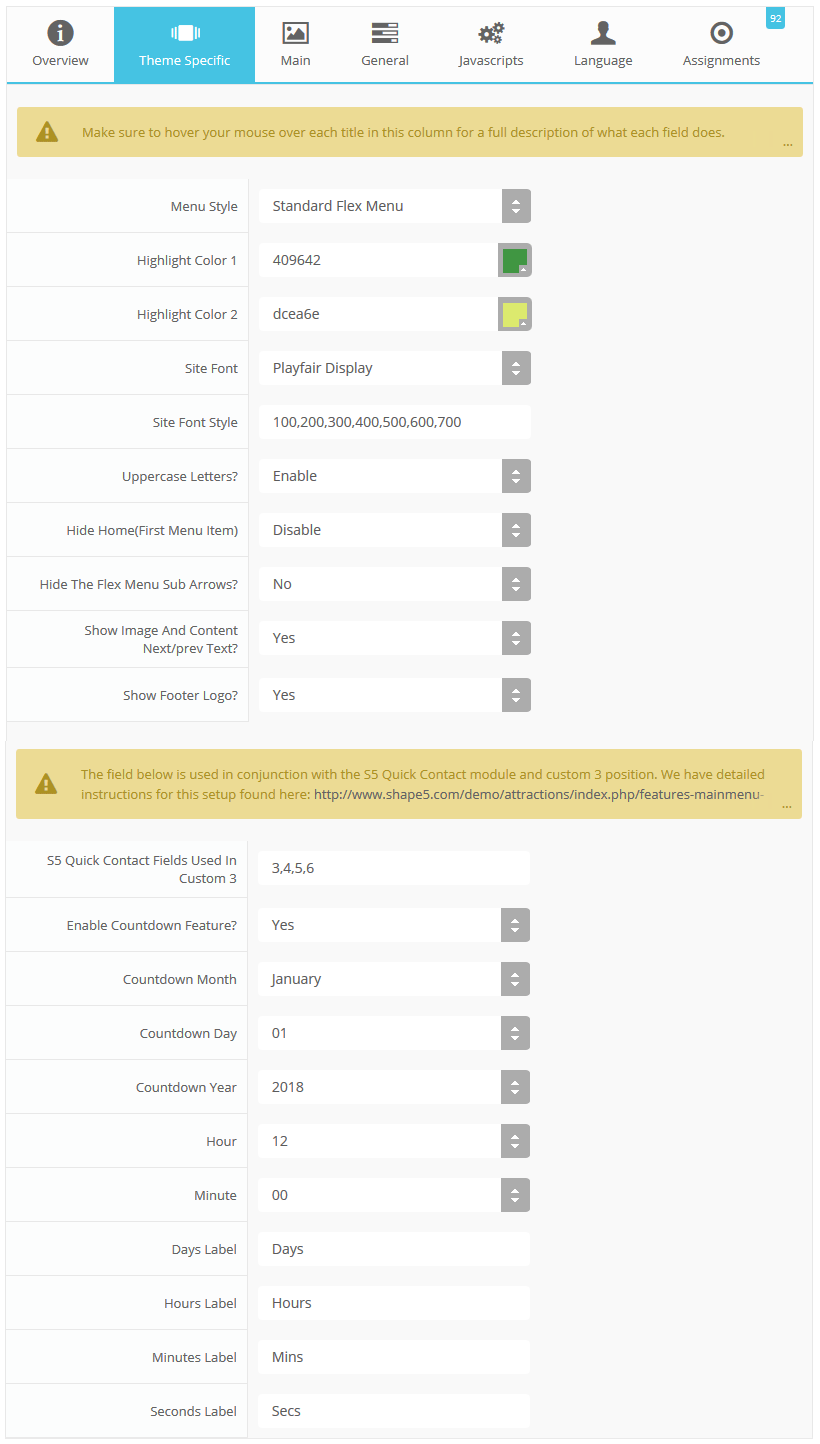
Theme Specific Configuration Interface of Vertex
Below is a screenshot that shows all the template specific features available in the user friendly Vertex admin:
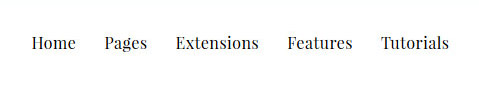
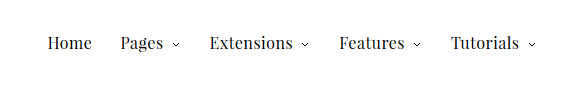
2 Menu Types
You can choose to either use the standard horizontal flex menu which is currently demo'd or the overlay menu style that is shown in the below image.
Custom Highlight Colors
Stylize your site with any color you want. Set your own custom color scheme with the built in highlight color. This color control menu items, titles, buttons, hover over effects, backgrounds, and more. You can set this color to any color that you want. Below is an example so you can see how this works. In addition to these color options, Vertex itself is loaded with background color and images options under the Main / Layout page in the template configuration.
Custom Highlight Font
Choose a custom highlight font powered by Google fonts. This font is used mostly on titles, buttons, labels and more. This is used in conjunction with the default site font which is controlled under the Main / Styling tab in the Vertex template configuration, and controls many other elements as well.
Uppercase Letters
Choose to enable or disable uppercase letters on most menu items, buttons, titles and more.
Hide First Menu Item
With this option you can hide the first menu item which usually is "home".
Hide Menu Arrows
With this option you can disable the menu item sub menu arrows on first level parent items.
Image and Content Fader Arrows
You can choose to hide the "Next" and "Prev" text and just show standards arrows instead as shown below:
Footer Logo
You can choose to hide the footer logo. This logo automatically pulls from whatever you do to the main site logo so you don't have to publish a logo in 2 places. The below image is showing the logo hidden. Refer to the footer of this page to see the logo shown.
Social Icons
Although not a special feature of the template, the Ion Icons enabled social icons are stylized for the custom_8 position.
All content and images shown on this site is for demo, presentation purposes only. This site is intended to exemplify a live website and does not make any claim of any kind to the validity of non-Shape5 content, images or posts published. Stock photography and icons are often purchased from shutterstock.com for the demonstration purposes of Shape5.com only, and are not included with this template or any of our downloads. Occasionally open source images are used, some of which are allowed for re-distribution as per their individual licenses, eg: unsplash.com. Images that are not included in our downloads are not licensed for re-distribution and therefore not included, you may not use these items for your own use without first purchasing them from their copyright owner. Links will be provided for some of these items if you wish to purchase them from their copyright owners or download them from their sources. Image(s) or Footage (as applicable from Shutterstock), used under license from Shutterstock.com.
So what are Site Shapers? They are quick installs of Joomla combined with all the modules, content, etc used on our demo, excluding stock photography. Within a few minutes you can have your site up, running and looking just like our demo. No more importing SQL dumps and installing modules. Just head on over to the download section of this template and grab a Site Shaper. Simply install the Site Shaper like any other Joomla installation, it's that easy!
Note - This site is intended to imitate a live and published website and does not make any claim of any kind to the validity of non-Shape5 content, articles, images or posts published to this site.
01Login to your cpanel or your server admin panel.
02Locate the area where your databases are (usually labeled Mysql Databases)
03Create a new database
04Next create a new database user and assign it to this newly created database in the previous step
05You will then need to extract the site shaper to either a folder on your server or the root directory such as WWW. NOTE: if you already have a website in the root of your WWW folder, we suggest creating a new folder and extract the site shaper there. If your cpanel does not have an extract option or you cannot find it, you may also extract the contents of your site shaper in to a folder on your desktop and upload all the files via an ftp client to your server.
06Next, navigate to the url where you extracted the site shaper via your web browser.
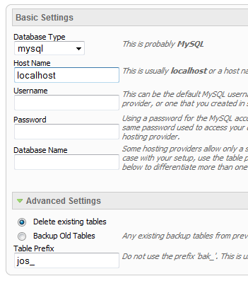
07Continue through each screen until you reach the below screenshot:
08At the above screen be sure to enter localhost as shown, continue to fill in the following text fields with your newly created database and username information
09Follow through the rest of the site shaper setup and click the install sample data at the last screen and the installation is complete! (be sure to rename/remove the installation directory after finishing the install)
Not only is this template beautifully designed but it is great for search engine optimization as well! What is SEO? It is simple the act of altering a web site so that it does well in the organic, crawler-based listings of search engines such as google.com. How does this template accomplish this? It's simple, the majority of your most valuable content is found in the main body of your site, through css we are able to alter the layout of the site and call the main content before the left and right columns are called. This allows for your content to be found first by search engines before it reaches your other content, which is vital in search engine optimization. This is a common feature this can be done with almost all of Shape 5 templates as well.
The S5 Instagram Feed module allows you to easily pull your instagram feed images onto your website so you can display them in any module position. You can set the feed to show in a horizontal manor by adding a fixed height like we did here on the homepage of the Attractions design. Or you can also just have it show in a square and the images will auto orient themselves depending on your screen resolution. Lastly you can set up to how many images are shown at once and if you want to show a border around them or not.
This module can be viewed on this page. The styling of the module shown here is customized specifically for this template with css overrides, and cannot be used with any other template. The same module can be used on any template, but with default or other styling in its place. Publish your own content into each slide transition and for multiple slide transition effects, navigation arrows and also a drop down gallery tab that allows you to select a slide via a thumbnail. You can setup your own custom HTML for each slide or have it automatically pull from articles. This module is fully responsive as well. The S5 Image and Content Fader is powered by Mootools/Jquery. Best of all it's free!
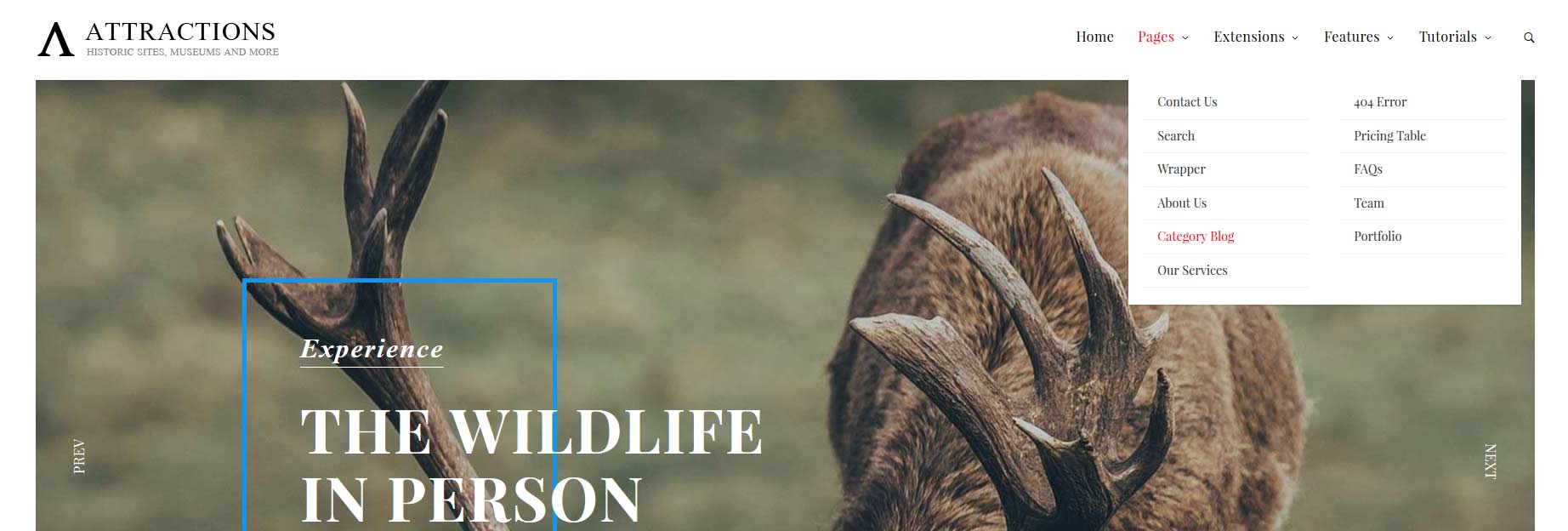
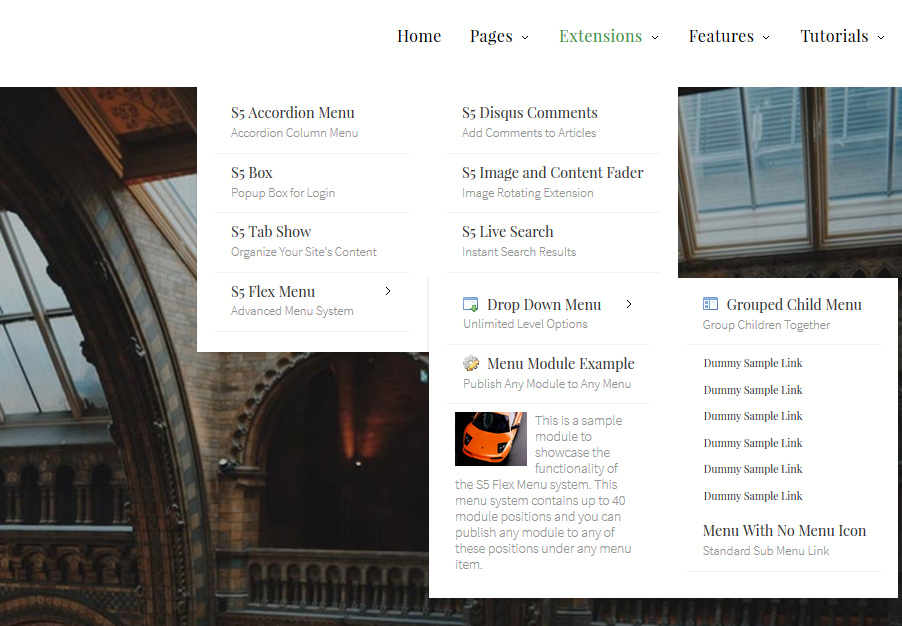
The S5 Flex Menu system is a very powerful plugin that provides functionality
far beyond what the standard Joomla menu system can provide. This plugin
is intended to be as an extension of the existing menu system in Joomla to add many new features! Please see the full list of features below.
This menu system works off of the core Joomla jquery/mootools scripts so no extra javascript library is needed and keep download sizes to a minimum. Also, if you do not want to use this menu you can simply turn it it off from the template configuration page.
Take your website to the next design level by using the robust and feature
rich S5 Flex Menu System. Organize your links with ease and show content
in places you never could before!
Menu Features:
Automatic onclick functionality for tablet sized touch screens. If a device's screen is detected as touch screen and is of table size, then the menu will function with an onclick method rather than the onmouseover effect that is shown on a laptop or desktop that has a mouse for use.
Multiple javascript effects such as fade, slide, etc.
Multiple columns for menu items or modules.
Modules load directly into the menu.
Group sub menu items into the same column or fly out.
Optional sub texts for each menu item.
Optional menu icon images for each menu item.
Automatic multi-language menu change. If you are setting up a multi-language site, the flex menu will automatically change if your site's visitor has a language specific menu setup for their language in the menu manager.
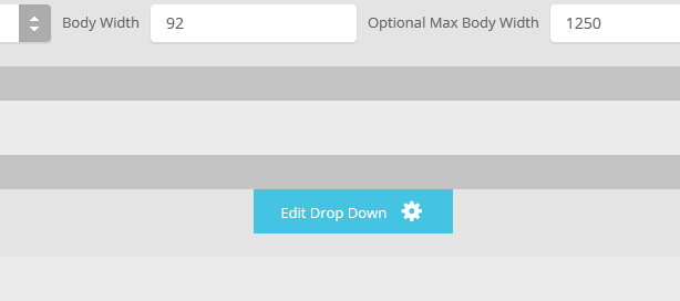
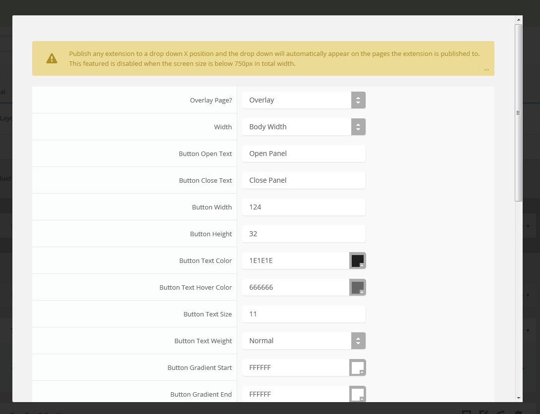
The S5 Drop Down Panel is a slide down panel that can be demo'd at the top of this page. The panel itself contains six module positions. You may publish any module that you wish into these positions. It comes packed with features so be sure to check out the list and screenshot below.
Note - If the responsive layout is enabled the drop down will disable when the screen size reaches 750px so that it does not interfere with the mobile menu bar
Customize almost everything! Shadows, borders, gradient, opacity
With over 1,000 rooms available you will have plenty of room to stay with us. We also have over 50 campgrounds available year round for those who prefer the outdoor life.


")