- Details
-
Written by Super User
-
Category: Latest
-
Published: 12 May 2013
-
Hits: 16510
This template is built on the very powerful S5 Vertex Framework, which comes packed with amazing features!
Learn More About Vertex...
Every template built on Vertex also comes with its own unique template specific options applicable to that particular template such as highlight colors, social icons, and much more. These features are in addition to the standard functions of Vertex, and are still controlled through the very user friendly interface of Vertex. This page will document the features specific to this template.
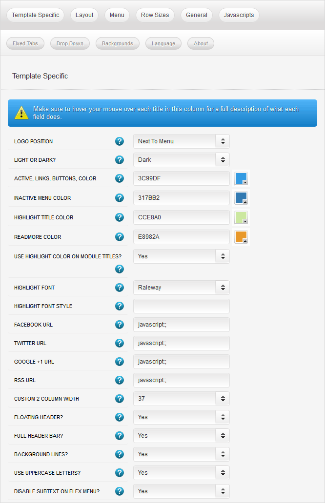
Template Specific Configuration Interface of Vertex
Below is a screenshot that shows all the template specific features available in the user friendly Vertex admin:
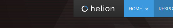
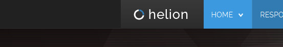
Logo Position
By default the logo of this template will appear in the top bar next to the menu. If your logo requires more space you can also put the logo below the menu bar.
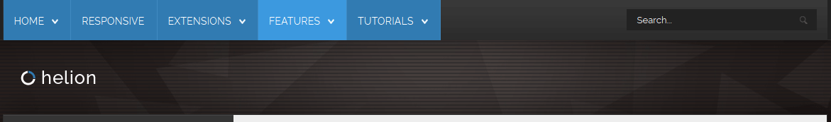
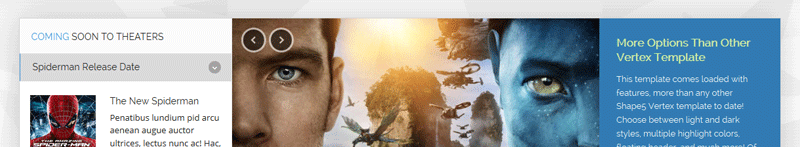
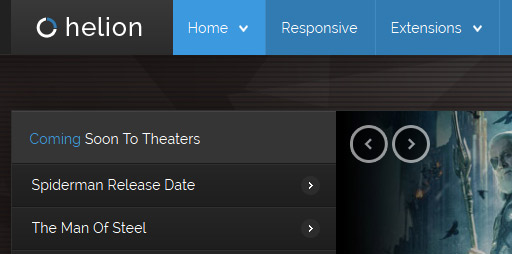
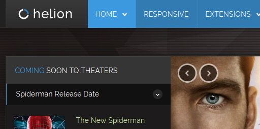
Light or Dark Style
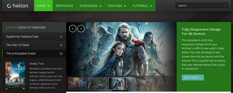
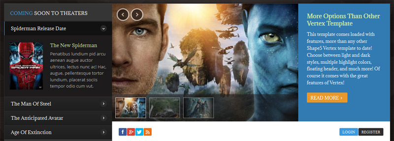
Easily switch between a light or dark style for your website, giving you the ultimate style flexibility. Click the images below for a live demo.
Dark Style:
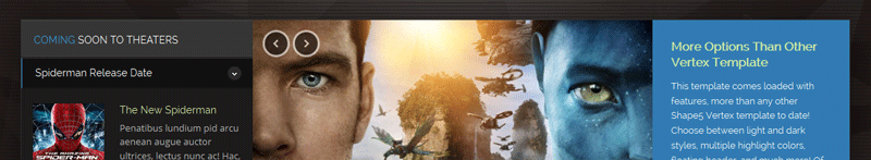
Light Style:
Custom Highlight Colors
Set your own custom color scheme with the built in highlight colors. There are two built in highlight colors that control menu items, titles, buttons, hover over effects, and much more. You can set these colors to any color that you want.
Module Title Highlight Color
By default module titles will be shown with two colors; the first word uses highlight1. You can disable this feature and use a single solid color as well.

Custom Highlight Fonts
Choose a custom highlight font powered by Google fonts. You can set a custom font for the S5 Flex Menu main level items, titles, buttons, and much more. This is used in conjunction with the default site font which is controlled under the Layout tab of Vertex, and controls many elements as well.
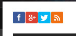
Social Icons
Easily link to a social media site with the built in social icons found in the header of this template. Simply enter the url of your social site in the configuration and the icon will automatically appear. To disable an icon simply leave the url blank for that particular icon.
Custom 2 Column Width
This template comes with a custom_2 module position that is next to the component and article area. This is a column that is outside the normal layout of Vertex, so it is included in the Template Specific tab. You can set this column to any width that you wish.
Floating Header
This template comes with the ability to enable or disable a floating header and menu area. This is a great way for your users to easily navigate your website! Please note that this is not the same as the floating menu feature default to Vertex, this feature floats the entire header not just the menu.

Header Bars
By default the header area extends the full width of the page, and shows bars on each side of the inner header area. If you likd you can turn these bars off and simply show a cut off header the same width as the main page.
Background Lines
The background of the page has very line and opaque horizontal lines that run over top of the background image. You can turn these lines off or choose to leave them on.
Uppercase Leters
Choose to enable or disable uppercase letters on most menu items, buttons, titles and more.
Small Menu
The S5 Flex Menu gives you the ability to have subtext on each menu item. If you choose not to use subtext on the first level links simply choose to disable this option and the menu will automatically down size.


 Menu Module Example

