This is a sample module published to the sidebar_top position, using the -sidebar module class suffix. There is also a sidebar_bottom position below the menu.
This is a sample module published to the sidebar_bottom position, using the -sidebar module class suffix. There is also a sidebar_top position below the search.
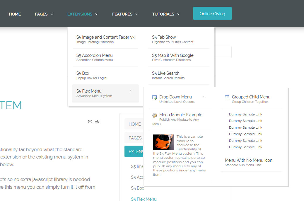
This is a sample module to showcase the functionality of the S5 Flex Menu system. This menu system contains up to 40 module positions and you can publish any module to any of these positions under any menu item.
This module can be viewed at the top of this page. This specific style of the module can only be used with this template with the template's css overrides. Publish your own content into each slide transition and for multiple slide transition effects, navigation arrows and also a drop down gallery tab that allows you to select a slide via a thumbnail. This module is fully responsive as well. The S5 Image and Content Fader v3 is powered by Mootools/Jquery. Best of all it's free!
This particular template showcases two different slide types. The first and third slides involved multiple layers of text and images. The middle slide is simply text that is centered and slides down. Below is the code used for both of these slide types.
Centered Text
Simply enter the following code into the text/html section of the module. Do not enter text into the title area:
<span class="center">
<span class="slide_title">
All New <strong> Media Player Plugin</strong>
</span>
<span class="center_text" style="font-size:1.3em;">
Explore the all the new mp3 and video player plugin. Easily setup and list
sermons and other media on your website with no programming experience for your
guests to listen to and download.
</span>
<br /><a style="float:none" class="readon" href="">See it in action</a>
</span>
Text and Image
Simply enter the following code into the text/html section of the module. The image that appears on the right side is entered into the right div below. You will need to choose your image carefully as there are size restrictions on the area, tall and somewhat narrow images work best. Do not enter text into the title area:
<span class="left">
<span class="slide_title">
Modern Design <br />Church Focused <br /><strong>Joomla Template</strong>
</span>
<span class="slide_text">
Take your church's presence to the next level with Risen Hope. This theme is
breathtaking and has everything you need to setup your site.
</span>
<br />
<a class="readon">Read More</a>
</span>
The S5 Flex Menu system is a very powerful plugin that provides functionality
far beyond what the standard Joomla menu system can provide. This plugin
is intended to be as an extension of the existing menu system in Joomla to add many new features! Please see the full list of features below.
This menu system works off of the core Joomla jquery/mootools scripts so no extra javascript library is needed and keep download sizes to a minimum. Also, if you do not want to use this menu you can simply turn it it off from the template configuration page.
Take your website to the next design level by using the robust and feature
rich S5 Flex Menu System. Organize your links with ease and show content
in places you never could before!
Menu Features:
Automatic onclick functionality for tablet sized touch screens. If a device's screen is detected as touch screen and is of table size, then the menu will function with an onclick method rather than the onmouseover effect that is shown on a laptop or desktop that has a mouse for use.
Multiple javascript effects such as fade, slide, etc.
Multiple columns for menu items or modules.
Modules load directly into the menu.
Group sub menu items into the same column or fly out.
Optional sub texts for each menu item.
Optional menu icon images for each menu item.
Automatic multi-language menu change. If you are setting up a multi-language site, the flex menu will automatically change if your site's visitor has a language specific menu setup for their language in the menu manager.
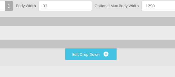
The S5 Drop Down Panel is a slide down panel that can be demo'd at the top of this page. The panel itself contains six module positions. You may publish any module that you wish into these positions. It comes packed with features so be sure to check out the list and screenshot below.
Note - If the responsive layout is enabled the drop down will disable when the screen size reaches 750px so that it does not interfere with the mobile menu bar
Customize almost everything! Shadows, borders, gradient, opacity
 Drop Down Menu
  Menu Module Example
  Grouped Child Menu
  Template Specific Features
  Vertex Template Features
  S5 Vertex Framework
  Continued Vertex Features


")