


Every template built on Vertex also comes with its own unique template specific options applicable to that particular template such as highlight colors, social icons, and much more. These features are in addition to the standard functions of Vertex, and are still controlled through the very user friendly interface of Vertex. This page will document the features specific to this template.
Template Specific Configuration Interface of Vertex
Below is a screenshot that shows all the template specific features available in the user friendly Vertex admin: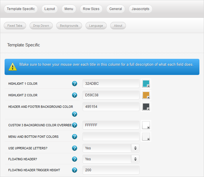
Custom Highlight Colors
Stylize your site with any color you want. Set your own custom color scheme with the built in highlight color. There are 2 custom highlight colors you can set. These colors control menu items, titles, buttons, hover over effects, backgrounds, and much more. You can set these colors to any color that you want. Below is an example so you can see how this works.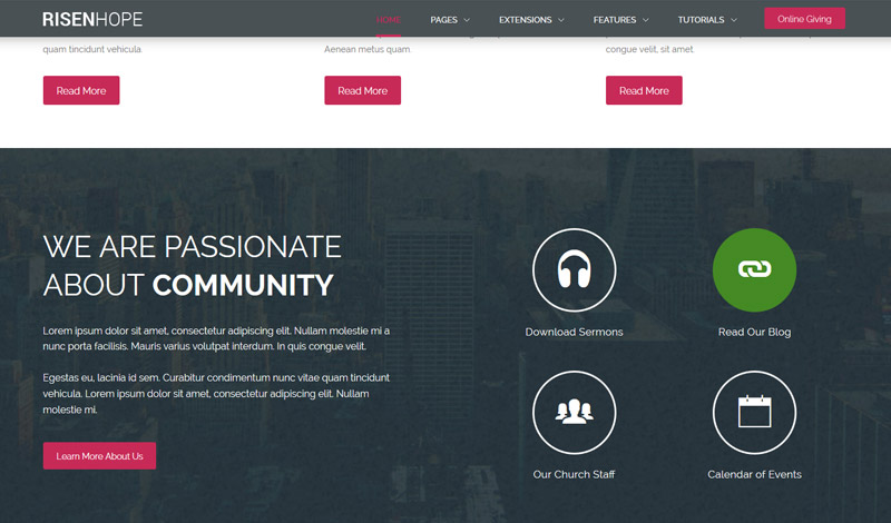
Custom_1, Custom_2 and Custom_3 Positions
This template contains three custom positions. custom_1 contains the Online Giving button found in the header, you can publish any content you wish to this area but due to its size it should remain limited. custom_2 contains the S5 Image and Content Fader module. Whenever this module is published and modules are published to the top_row1 area, the top_row1 area will overlap the custom_2 position as shown on the homepage. custom_3 is found directly under the the top_row1 area and it contains the S5 Tab Show module.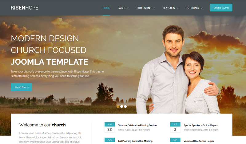
Header and Bottom Color
By default the header color is a dark grey, however you can change this to any color you want, along with the font color that shows on top of it for the menu. These colors also effect the bottom row and the custom_3 position. Alternatively, you can control custom_3 with an override color, because it is intended to be dark with white text.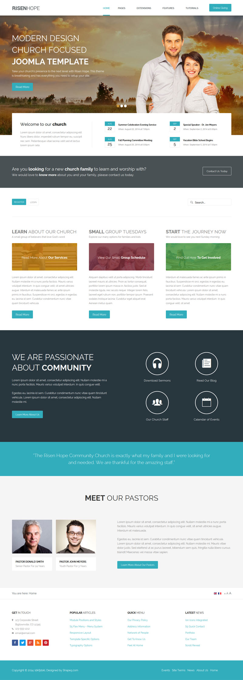
Uppercase Letters
Choose to enable or disable uppercase letters on most menu items, buttons, titles and more.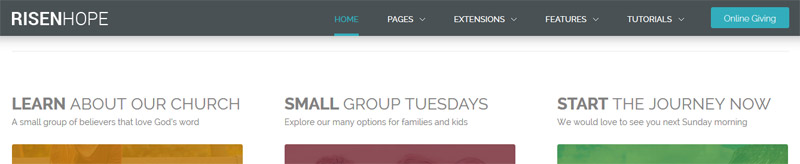
Floating Header
This template comes with the ability to enable or disable a floating header and menu area. The header will automatically decrease in size and stay at the top of the website at whatever trigger height you set it to. This is a great way for your users to easily navigate your website! Note - this feature does disable for small tablets and mobile devices.

")