Every template built on Vertex also comes with its own unique template specific options applicable to that particular template such as highlight colors, social icons, and much more. These features are in addition to the standard functions of Vertex, and are still controlled through the very user friendly interface of Vertex. This page will document the features specific to this template.
Theme Specific Configuration Interface of Vertex
Below is a screenshot that shows all the template specific features available in the user friendly Vertex admin: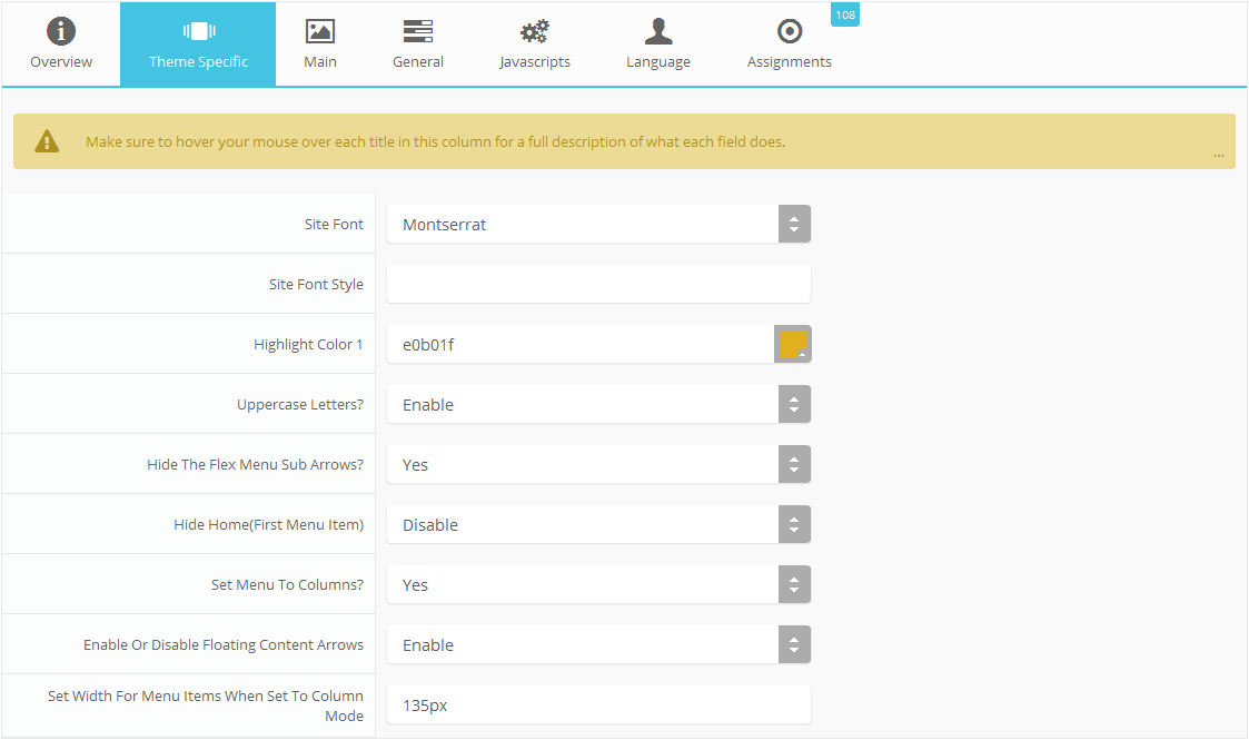
Custom Highlight Colors
Stylize your site with any color you want. Set your own custom color scheme with the built in highlight color. These colors control menu items, titles, buttons, hover over effects, backgrounds, and more. You can set this color to any color that you want. Below is an example so you can see how this works. In addition to these color options, Vertex itself is loaded with background color and images options under the Main / Layout page in the template configuration.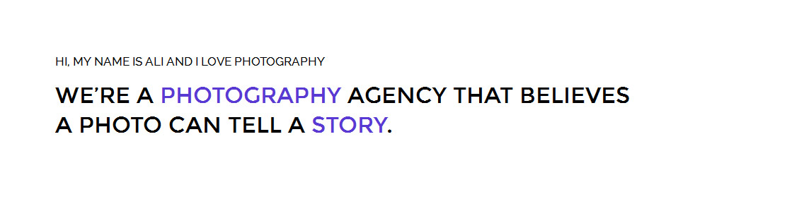
Custom Highlight Font
Choose a custom highlight font powered by Google fonts. This font is used mostly on titles, buttons, labels and more. This is used in conjunction with the default site font which is controlled under the Main / Styling tab in the Vertex template configuration, and controls many other elements as well.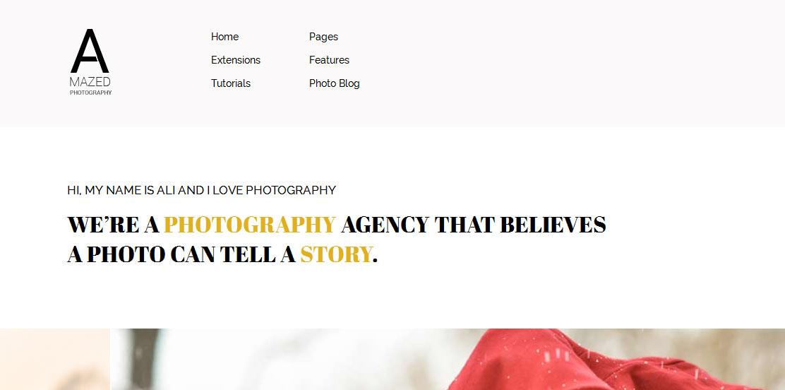
Uppercase Letters
Choose to enable or disable uppercase letters on most menu items, buttons, titles and more.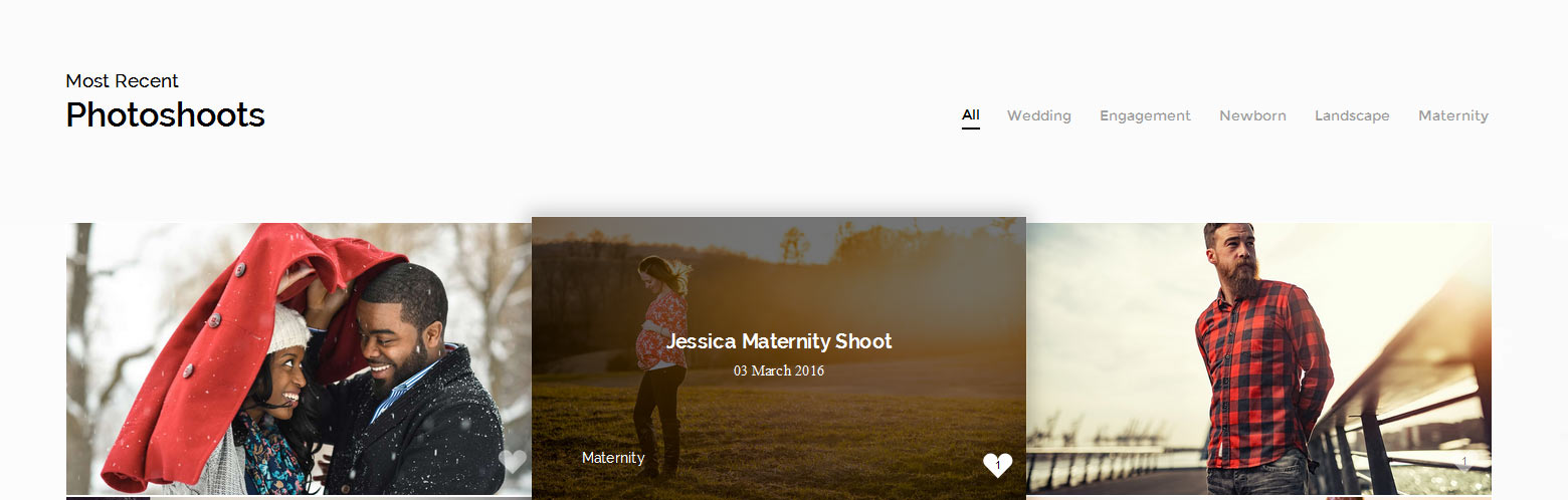

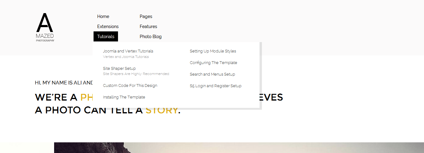
Menu Style: Columns or Standard
This feature allows you to choose between the standard horizontal layout of the flex menu or column version. If you choose the column version you need to add a menu item spacer where you want each column to break. Create an external menu item link with a CSS class of "spacerlink" set to it. Then just place the spacer where you desire the menu items to break and create columns. Lastly be sure to enter a column width in the "theme specific" area of Vertex: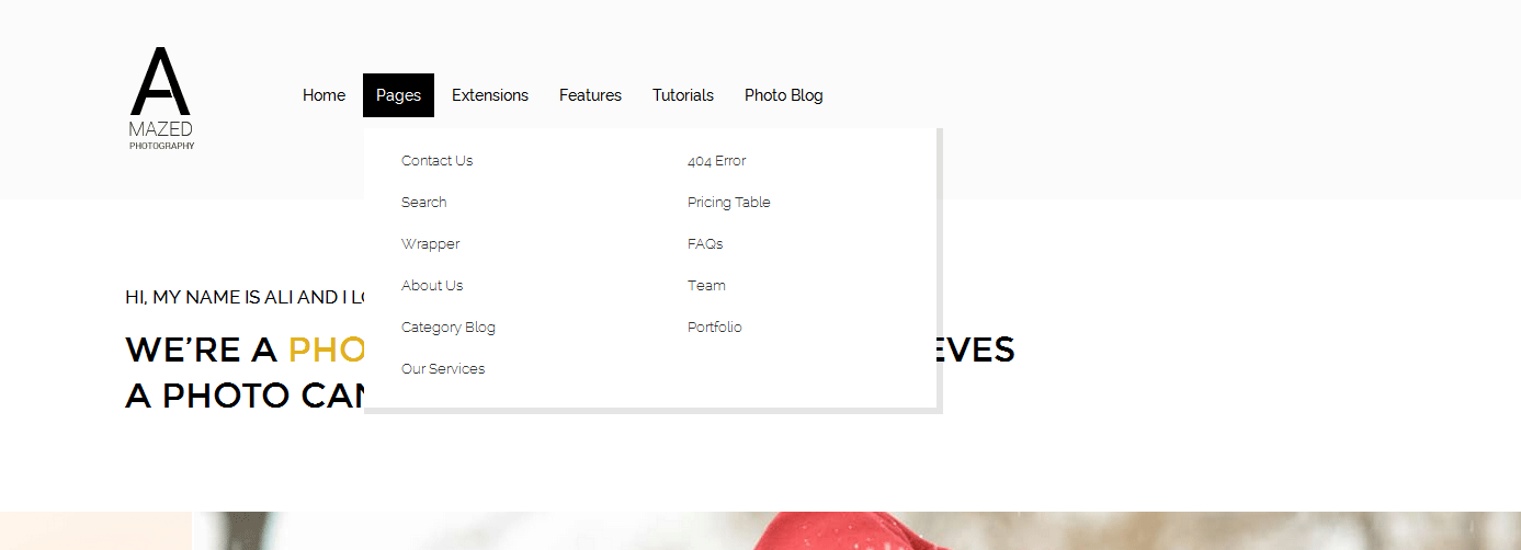
Demo - Column Menu
Demo - Standard Menu
Floating Next and Previous Arrows
With this feature you can set the next and previous arrows to show like the below image displays them. This is great for your photo blog area when your users want to easily browse back and forth between your photo shoots. You can disable this in the "theme specific" area of Vertex.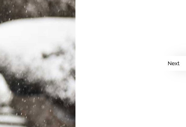
Hide Menu Arrows
With this option you can disable the menu item sub menu arrows on first level parent items.