Home
Responsive
- S5 Accordion Menu
- S5 Box
-
 Menu Module Example
 - Dummy Sample Link
- Dummy Sample Link
- Dummy Sample Link
- Dummy Sample Link
- Dummy Sample Link
- Dummy Sample Link
- Menu With No Menu Icon
- S5 Tab Show
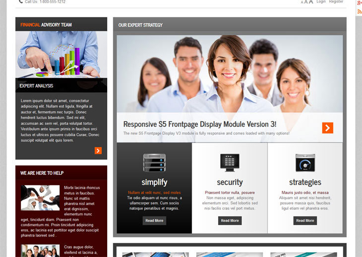
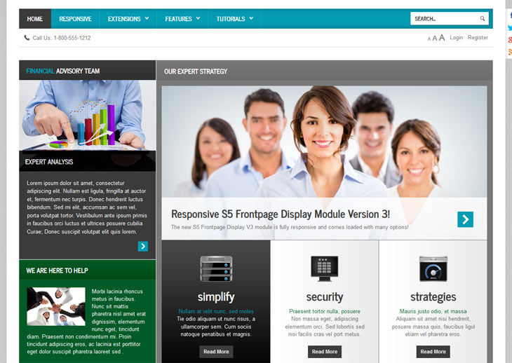
- S5 Frontpage Display
Menu Module Example This is an example of a module published to the drop_down row. This row contains 6 modules. To enable the drop down simple publish any module to any of the drop_down_x positions.
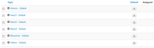
 Drop Down MenuUnlimited Level OptionsMenu Module ExamplePublish Any Module to Any Menu
 Grouped Child MenuGroup Children Together
 S5 Vertex FrameworkLearn More About Vertex
 Template Specific FeaturesOptions Specific To This Template
 Vertex Template FeaturesPowerful Template Settings
 J! StuffDefault Joomla Items
 Joomla and Vertex TutorialsVertex and Joomla Tutorials
 Continued Vertex FeaturesMore Great S5 Vertex OptionsJoomla and Vertex TutorialsVertex and Joomla Tutorials
This is a sample blockquote. Use <blockquote><p>Your content goes here!</p></blockquote> to create a blockquote.
This is an image with the "boxed" class applied:

This is an image with the "boxed_black" class applied:
This is an image with the "padded" class applied:
This is an image with the "full_width" class applied. This can also be done automatically in the template configuration. Be sure to review our Vertex Guide here for other full width image options.

The following list will support lists up to number 9, add the following class to the UL wrapping the below LI elements, class="ul_numbers":

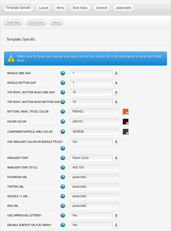


This template comes loaded with options that you can use to customize your site exactly how you want it. Here's how to get to these custom settings: