-
Details
-
Written by Super User
-
Category: Latest
-
Published: 12 May 2013
-
Hits: 8304
This is a sample blockquote. Use <blockquote><p>Your content goes here!</p></blockquote> to create a blockquote.
<div class="s5_greenbox"> <div class="point"> Your text here </div> </div>
<div class="s5_redbox"> <div class="point"> Your text here </div> </div>
<div class="s5_bluebox"> <div class="point"> Your text here </div> </div>
<div class="s5_graybox"> <div class="point"> Your text here </div> </div>
This is a styled box. Use <div class="black_box">Your content goes here!</div>
This is a styled box. Use <div class="gray_box">Your content goes here!</div>
This is a styled box. Use <div class="red_box">Your content goes here!</div>
This is a styled box. Use <div class="blue_box">Your content goes here!</div>
This is a styled box. Use <div class="green_box">Your content goes here!</div>
This is a styled box. Use <div class="yellow_box">Your content goes here!</div>
This is a styled box. Use <div class="orange_box">Your content goes here!</div>
This is an image with the "boxed" class applied:

This is an image with the "boxed_black" class applied:
This is an image with the "padded" class applied:
This is an image with the "full_width" class applied. This can also be done automatically in the template configuration. Be sure to review our Vertex Guide here for other full width image options.

Heading 1
Heading 2
Heading 3
Heading 4
Heading 5
<a> With readon class applied:
readon
<span> With highlight1_text class applied:
highlight1_text
<span> With highlight2_text class applied:
highlight2_text
<span> With highlight_font class applied:
highlight_font
<span> With uppercase class applied:
uppercase
This is a sample title_image class:
 First Line Of Text
Second Line
<div class="title_image">
<img src="images/spotlight1.jpg" alt="" />
<span class="title_image_text">JFirst Line Of Text<br />Second Line</span>
<a href=""
class="title_image_arrow"></a>
</div>
This is a sample code div. Use <div class="code">Your content goes here!</div> to create a code div.
#s5_code { width: 30px; color: #fff; line-height: 45px; }
- This is an Ordered List
- Congue Quisque augue elit dolor nibh.
- Condimentum elte quis.
- Opsum dolor sit amet consectetuer.
- This is an Unordered List
- Congue Quisque augue elit dolor nibh.
- Condimentum elte quis.
- Opsum dolor sit amet consectetuer.
- This is an Unordered List with class plus
- Congue Quisque augue elit dolor nibh.
- Condimentum elte quis.
- Opsum dolor sit amet consectetuer.
- This is an Unordered List with class ul_arrow
- Congue Quisque augue elit dolor nibh.
- Condimentum elte quis.
- Opsum dolor sit amet consectetuer.
- This is an Unordered List with class ul_star
- Congue Quisque augue elit dolor nibh.
- Condimentum elte quis.
- Opsum dolor sit amet consectetuer.
- This is an Unordered List with class ul_bullet
- Congue Quisque augue elit dolor nibh.
- Condimentum elte quis.
- Opsum dolor sit amet consectetuer.
The following list will support lists up to number 9, add the following class to the UL wrapping the below LI elements, class="ul_numbers":
- This is a sample styled number list <li class="li_number1">Your content goes here!</li>
- This is a sample styled number list <li class="li_number2">Your content goes here!</li>
- This is a sample styled number list <li class="li_number3">Your content goes here!</li>
- This is a sample styled number list <li class="li_number4">Your content goes here!</li>
Basic
$49/per month
Unlimited Space & Traffic
99.9% Server Uptime
24/7 Customer Care
30 Days Money Back
Standard
$79/per month
Unlimited Space & Traffic
99.9% Server Uptime
24/7 Customer Care
30 Days Money Back
FREE Domain Name
Personal Concierge
Premium
$99/per month
Unlimited Space & Traffic
99.9% Server Uptime
24/7 Customer Care
30 Days Money Back
FREE Domain Name
To use the price table on your site grab the following example code below and add to your site. The price table is fully responsive and can display up to 7 price columns. Once you have determined the number of columns you will be using set the wrapper div to the number of columns that you've added. You can use the wrapping classes of "s5_pricetable_1" to "s5_pricetable_7".
<div class="s5_pricetable_3">
<div class="s5_pricetable_column">
<div class="s5_pricetable_column_padding">
<div class="s5_title">Basic</div>
<span class="dollarsign">$</span><span class="price">49</span><span class="month">/per month</span>
<div class="s5_options">
Unlimited Space & Traffic<br>
99.9% Server Uptime<br>
24/7 Customer Care<br>
30 Days Money Back<br><br>
</div>
<div class="s5_horizontalrule"></div>
<div class="s5_buttoncenter"><a class="button s5_pricetable" href="#">Choose</a></div>
</div>
</div>
<div class="s5_pricetable_column recommended">
<div class="s5_pricetable_column_padding">
<div class="s5_title">Standard</div>
<span class="dollarsign">$</span><span class="price">79</span><span class="month">/per month</span>
<div class="s5_options">
Unlimited Space & Traffic<br>
99.9% Server Uptime<br>
24/7 Customer Care<br>
30 Days Money Back<br>
FREE Domain Name<br>
Personal Concierge
</div>
<div class="s5_horizontalrule"></div>
<div class="s5_buttoncenter"><a class="button s5_pricetable" href="#">Choose</a></div>
</div>
</div>
<div class="s5_pricetable_column">
<div class="s5_pricetable_column_padding">
<div class="s5_title">Premium</div>
<span class="dollarsign">$</span><span class="price">99</span><span class="month">/per month</span>
<div class="s5_options">
Unlimited Space & Traffic <br>
99.9% Server Uptime<br>
24/7 Customer Care<br>
30 Days Money Back<br>
FREE Domain Name
</div>
<div class="s5_horizontalrule"></div>
<div class="s5_buttoncenter"><a class="button s5_pricetable" href="#">Choose</a></div>
</div>
</div>
<div style="clear:both;"></div>
</div>
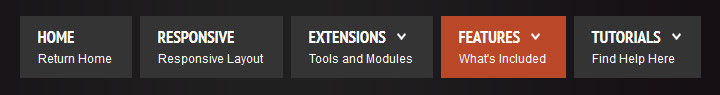
 Menu Module Example

