Setting Up Module Styles

Sample Drop Down Module

This is an example of a module published to the drop_down row. This row contains 6 modules. To enable the drop down simple publish any module to any of the drop_down_x positions.

Open Panel
  • Register

Custom 1

This is the custom_1 position with the class -transparent_dark applied. It is designed to be 100% of the this area's width. There is also a custom_2 position that will appear in the upper right corner of this area, but should only be used if custom_1 is taller than custom_2.

Top Row1 Modules

This is an example of a module published to the top_row_1 row with the class -transparent_dark applied. This row contains 6 modules, read below for a full description.

Custom 3

This is the custom_3 position. It is designed to be 100% of the this area's width.

Top Row2 Modules

This is an example of a module published to the top_row_2 row. This row contains 6 modules, read below for a full description.

Top Row3 Modules

This is an example of a module published to the top_row_3 row. This row contains 6 modules, read below for a full description.


All modules are fully collapsible

What exactly is a collapsing module? It's quite simple, whenever a module is not published to a postion that position does not appear on the frontend of the template. Consider the example below:


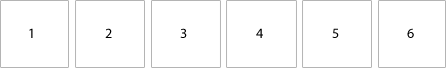
This particular row has 6 module positions available to publish to. Let's say you only want to publish to 4 of these positions. The template will automatically collapse the modules you do not want to use and adjust the size of the modules accordingly:


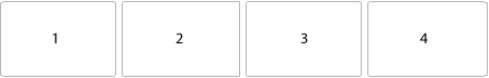
If no modules are published to the row the entire row itself will not show. The best feature of this is every module can be published to its own unique pages so the layout of your site can change on every page!


Infinite Layouts

Because there are so many module positions available in so many different areas, the number of layouts you can create are limitless! For example, if you would like to show your main content area on the right side of your site but still have a column of modules, simply published your modules to the right or right_inset positions or both. The same would be true for the opposite, if you want a column on the left simply publish modules to left or left_inset. Of course you can always choose to not have a column at all. Remember, any module not published to will automatically collapse and the remaining area will automatically adjust. There is no need to choose a pre-defined layout for your entire site, simply use the power of collpasing module positions and take advantage of the numerous amount of module positions to create any layout you can dream of! Be sure to checkout the layout of modules below.


Dozens of Modules

Below is a complete list of all the module positions available for this template.


How to install and setup module styles:

  1. Download any module you wish to publish to your site.
  2. In the backend of Joomla navigate to the menu item Extensions/Install Uninstall


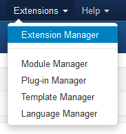
  3. Browse for the module's install file and click Upload File & Install.
  4. Once the module has be installed navigate to the menu item Extensions/Module Manager (same menu as above)
  5. Find the Module just installed and click on it's title.
  6. Change any parameters that you wish and be sure to set it to published and publish it to your desired module position.
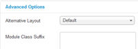
  7. To apply a module style simply fill in the module class suffix field with any of this template's included module styles. This parameter setting is found under Module Parameters on the right side of the screen.


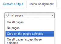
  8. Assign what pages you would like the module to appear on and finally click Save.


Right

This is an example of a module published to the right position. There are also left, insets, rows, etc. positions and many others, be sure to read the full description. This is the default style that will appear for most module positions in the white body area.

Dynamic Colors

To use a dynamic color for a module title simply enter any hex color code along with any module class suffix you would like use into the module class field of any module:

Examples:
BF1FAE
-dark 058B0F
-transparent_dark D69E16
-no_padding A81111

You must enter the suffix exactly as shown with a space after the suffix. If you are not using a class suffix simply enter the hex color only. This can be applied to any module class above.

-no_padding

This is the -no_padding module style and can be applied to most most module positions.

-none

This is the -none module style and can be applied to most most module positions.

-dark

This is the -dark module style and can be applied to most most module positions.

-underlined1

This is the -underlined1 module style and can be applied to most most module positions.

-underlined2

This is the -underlined2 module style and can be applied to most most module positions.

-underlined3

This is the -underlined3 module style and can be applied to most most module positions.

-highlight1_hover

This is the -highlight1_hover module style and can be applied to most most module positions. Hover over this module to see its effect.

-highlight2_hover

This is the -highlight2_hover module style and can be applied to most most module positions. Hover over this module to see its effect.

-transparent_dark

This is the -transparent_dark module style and can be applied to most most module positions. This module is intended to be used over a background image since it is transparent, because this module is shown on a white background it will not show transparent.

-transparent_dark_extra_padding

This is the -transparent_dark_extra_padding module style and can be applied to most most module positions. This module is intended to be used over a background image since it is transparent, because this module is shown on a white background it will not show transparent.

-transparent_light

This is the -transparent_light module style and can be applied to most most module positions. This module is intended to be used over a background image since it is transparent, because this module is shown on a white background it will not show transparent.

-transparent_light_extra_padding

This is the -transparent_light_extra_padding module style and can be applied to most most module positions. This module is intended to be used over a background image since it is transparent, because this module is shown on a white background it will not show transparent.

Bottom Row1 Modules

This is an example of a module published to the bottom_row_1 row. This row contains 6 modules, read above for a full description.

Bottom Row2 Modules

This is an example of a module published to the bottom_row_2 row. This row contains 6 modules, read above for a full description.

Custom 4

This is the custom_4 position. It is designed to be 100% of the this area's width.

Custom 5

This is the custom_5 position with the class -transparent_dark applied. It is designed to be 100% of the this area's width.

Bottom Row3 Modules

This is an example of a module published to the bottom_row_3 row with the class -transparent_dark applied. This row contains 6 modules, read above for a full description.

S5 Box

Login

Register