This is a sample module published to the sidebar_top position, using the -sidebar module class suffix. There is also a sidebar_bottom position below the menu.
This is a sample module published to the sidebar_bottom position, using the -sidebar module class suffix. There is also a sidebar_top position below the search.
Setting Up Module Styles
Sample Drop Down Module
This is an example of a module published to the drop_down row. This row contains 6 modules. To enable the drop down simple publish any module to any of the drop_down_x positions.
This is the -bigtitle module style and can be applied to most module positions.
Top Row1 Modules
This is an example of a module published to the top_row_1 row. This row contains 6 modules, read below for a full description.
Top Row2 Modules
This is an example of a module published to the top_row_2 row. This module is using the class "-white" which can be used on any dark background. This row contains 6 modules, read below for a full description.
-big title_lightgray
This is the -bigtitle_lightgray module style and can be applied to most module positions.
-big title_white
This is the -bigtitle_white module style and can be applied to most module positions.
Top Row3 Modules
This is an example of a module published to the top_row_3 row, it is shown using the class suffix -white_large. This row contains 6 modules, read below for a full description.
Occasionally we need to use custom html to obtain the layouts shown on our demos in specific modules. The code below is what was used on this template:
Image and Content Fader Code:
This is for the code that we used in the "description" box for the image and content fader.
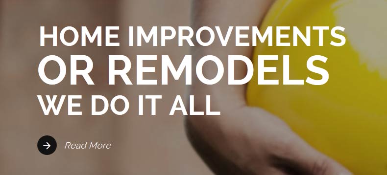
<span class="center">
<span class="s5_iacfbig">or remodels</span><br>
We do it all
<br>
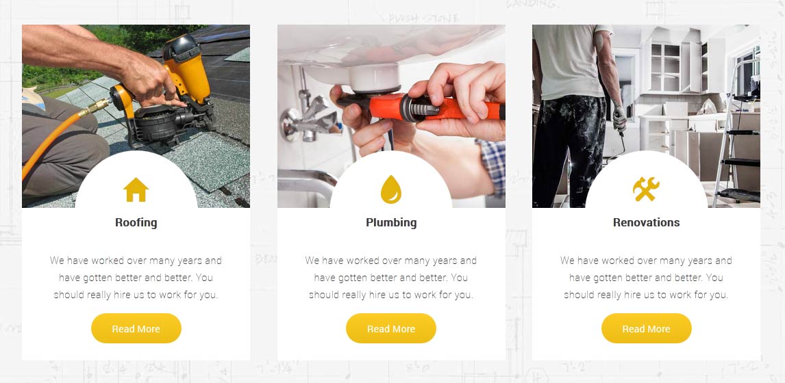
The below code is duplicated three times for each tab show position. Notice the "three" in the first DIV below. This can be changed from two,three,four,five and six depending on how many you desire in one row.
<div class="overlay_outer three">
<div class="overlay_inner_gc">
<div class="overlay_whiteback">
<img src="images/cust1.jpg" alt="roofing"/>
<div class="overlay_whiteback_inner">
<div class="overlay_whiteback_icon">
<span class="ion-android-home whitebacki"></span>
<strong>Roofing</strong>
</div>
<div class="overlay_whiteback_text">
We have worked over many years and have gotten better and better. You should really hire us to work for you.
<br><br>
<a class="readon" href="#s5_bottom_row1_area1">Read More</a>
</div>
</div>
</div>
</div>
</div>
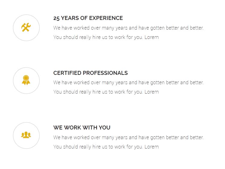
About Us Circles:
The following code can be duplicated three times to show just like we have done on the demo here published to the "Top Row 2_1" position.
<div class="gc_aboutus_circle_right">
<h5>25 Years of Experience</h5>
We have worked over many years and have gotten better and better. You should really hire us to work for you. Lorem
</div>
<div style="clear:both;height:85px;"></div>
Module Pre-text:
This is the code that is published to the pre-text areas of the S5 Quick Contact and S5 Vertical Accordion modules
The Mail Chimp Signup module is demo'd on this page. The module is AJAX powered and allows your users to instantly signup and get added to your MailChimp list that you specify in the module admin. All you need to do is enter your MailChimp API Key and Unique List ID. The styling of the module shown here is customized specifically for this template with css overrides, and cannot be used with any other template. The same module can be used on any template, but with default or other styling in its place.
The Contact Popup module is a quick way for your visitors to email you. The module is protected by the powerful Google reCaptcha plugin and uses AJAX to error check and send the email. https://www.google.com/recaptcha. Be sure that your server has the mail() php function enabled or the email will not send from the module. The module is located in the bottom lower right of the website.
We recommend publishing to a module position that is near the bottom of your site. For example we have it published to our "bottom_menu" position for this demo.
NOTE: This is not a "live chat" it simply sends an email.
Features at a Glance:
AJAX powered
Spam controlled through Google reCaptcha
Set the color and hover color
Set the name, email, message and submit button text
Ion Icons is an iconic font that gives you scalable vector icons that can be customized by any font css command, such as size, color, backgrounds, hover effects and more. Below you will see several examples of this feature in action, but please visit http://ionicons.com/ for a full list of all icons available.
Our Scroll Reveal feature is powered by the script found here: https://github.com/julianlloyd/scrollReveal.js. The script allows you to add "data-scroll-reveal" to HTML elements for on page scroll animations. We recommend adding to DIVs over SPAN etc as DIVs can move vs SPAN tags just fading in. Once you add the code to a DIV refresh a page or scroll down and it will animate in. It will only do this once until you refresh the page again. The great feature about the script is you can use plain English to describe how you'd like to animate your HTML element.
Example of this in action (refresh this page if you didn't see it already):
Enter from the left and move up 50px in 1.33 seconds.
Enter from the bottom after 1 second.
Wait 2.5 seconds and then ease-in-out 100px.
Code used for the above:
<div data-scroll-reveal="enter left and move 50px over 1.33s"> Enter from the left and move up 50px in 1.33 seconds. </div>
<div data-scroll-reveal="enter from the bottom after 1s"> Enter from the bottom after 1 second. </div>
<div data-scroll-reveal="wait 2.5s and then ease-in-out 100px"> Wait 2.5 seconds and then ease-in-out 100px. </div>
This is an example of a module published to the right position. There are also left, insets, rows, etc. positions and many others, be sure to read the full description. This is the default style that will appear for most module positions in the white body area.
-dark
This is the -dark module style and can be applied to most module positions.
-gray
This is the -gray module style and can be applied to most module positions.
-highlight1
This is the -highlight1 module style and can be applied to most module positions.
-highlight2
This is the -highlight2 module style and can be applied to most module positions.
Bottom Row1 Modules
This is an example of a module published to the bottom_row_1 row. This row contains 6 modules, read above for a full description.
Bottom Row2 Modules
This is an example of a module published to the bottom_row_2 row. This row contains 6 modules, read above for a full description.
Bottom Row3 Modules
This is an example of a module published to the bottom_row_3 row. This row contains 6 modules, read above for a full description.
 Template Specific Features
  Vertex Template Features
  S5 Vertex Framework
  Continued Vertex Features
  Drop Down Menu
  Menu Module Example
  Grouped Child Menu